

I was tasked to create a typographic piece ready to be submitted for the ISTD student briefs. I decided to go with brief 5 where I had to create a design with the main goal of trying to get the public to reconnect with the outside world and leave a positive impact on their mental health and well being.
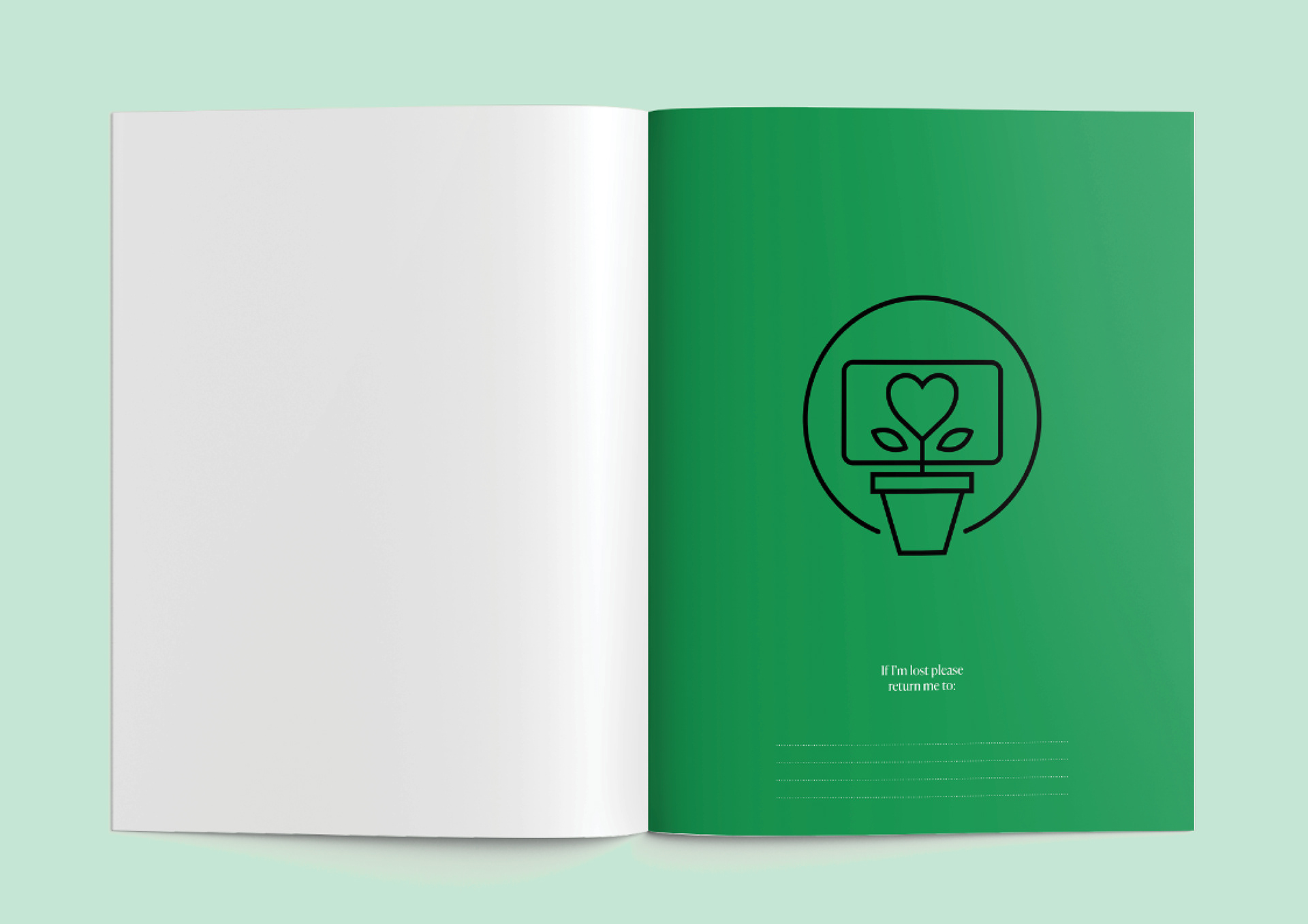
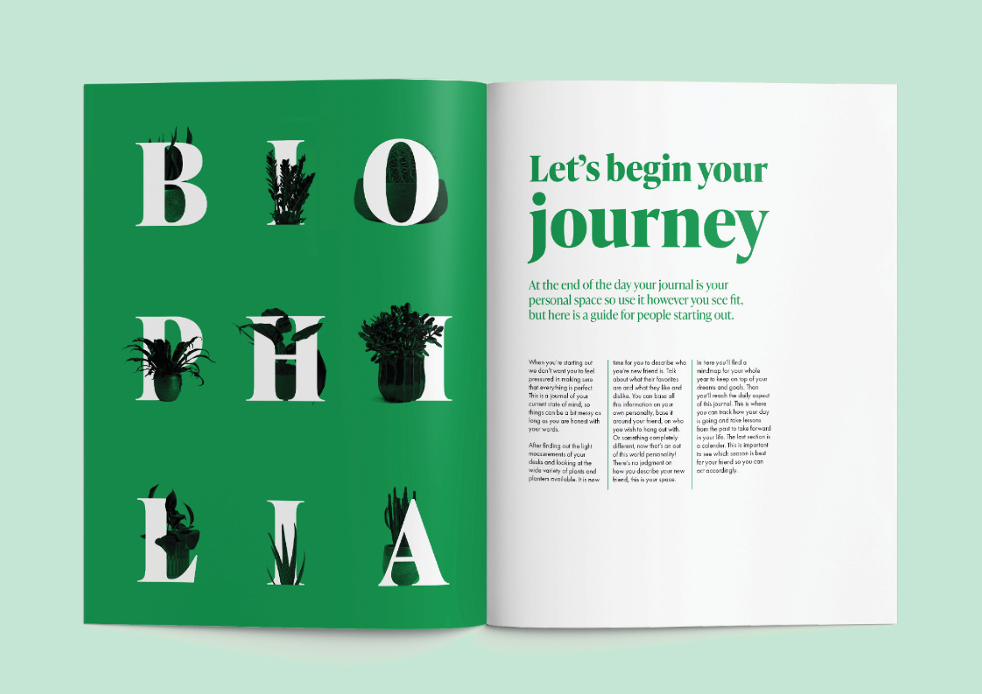
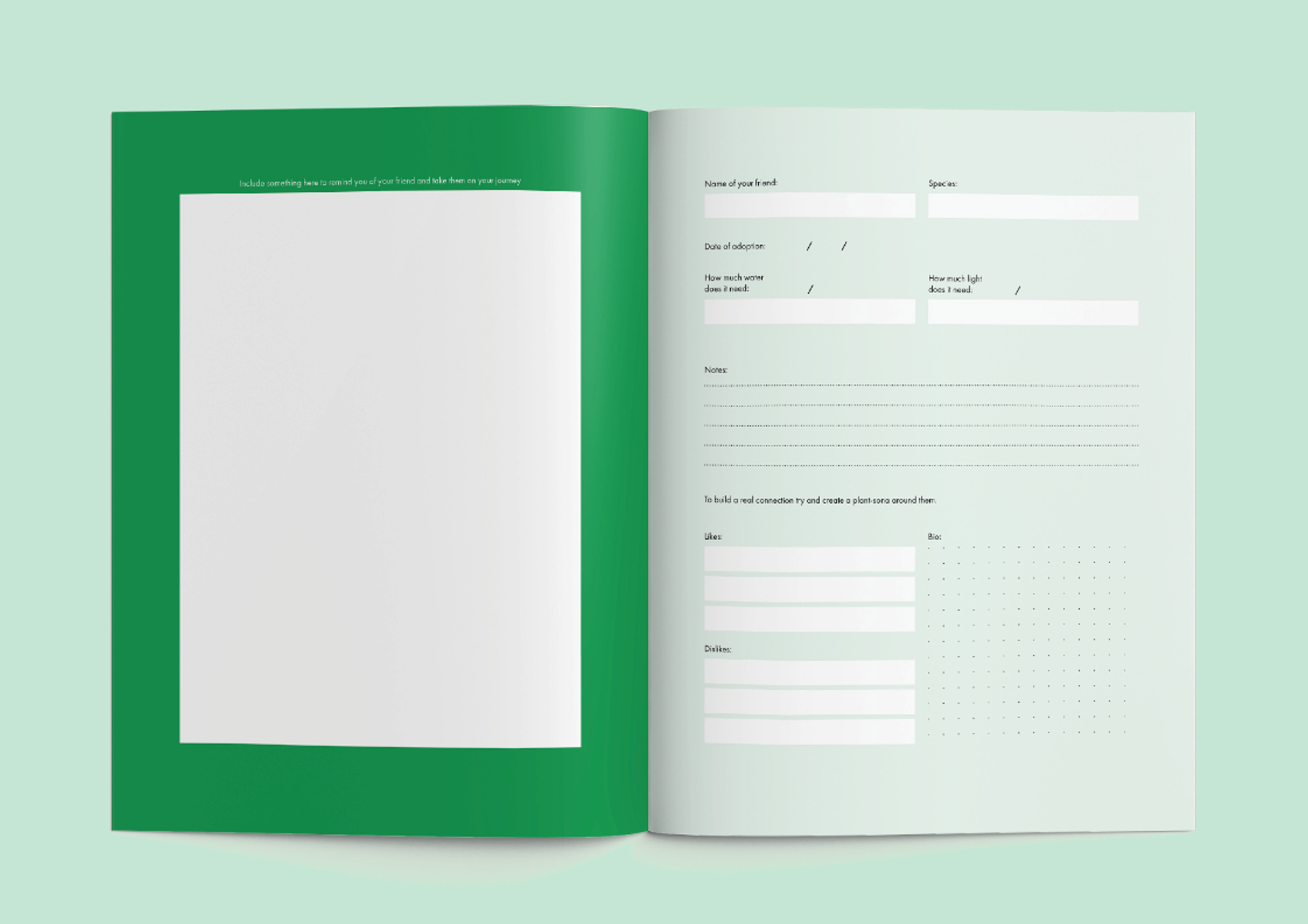
For my artefact, I decided to create a combination of a book/journal. The concept behind this idea is focused on office environments and the impact of bringing a plant and placing them on your desk. Which is where the name DeskFriend comes from.
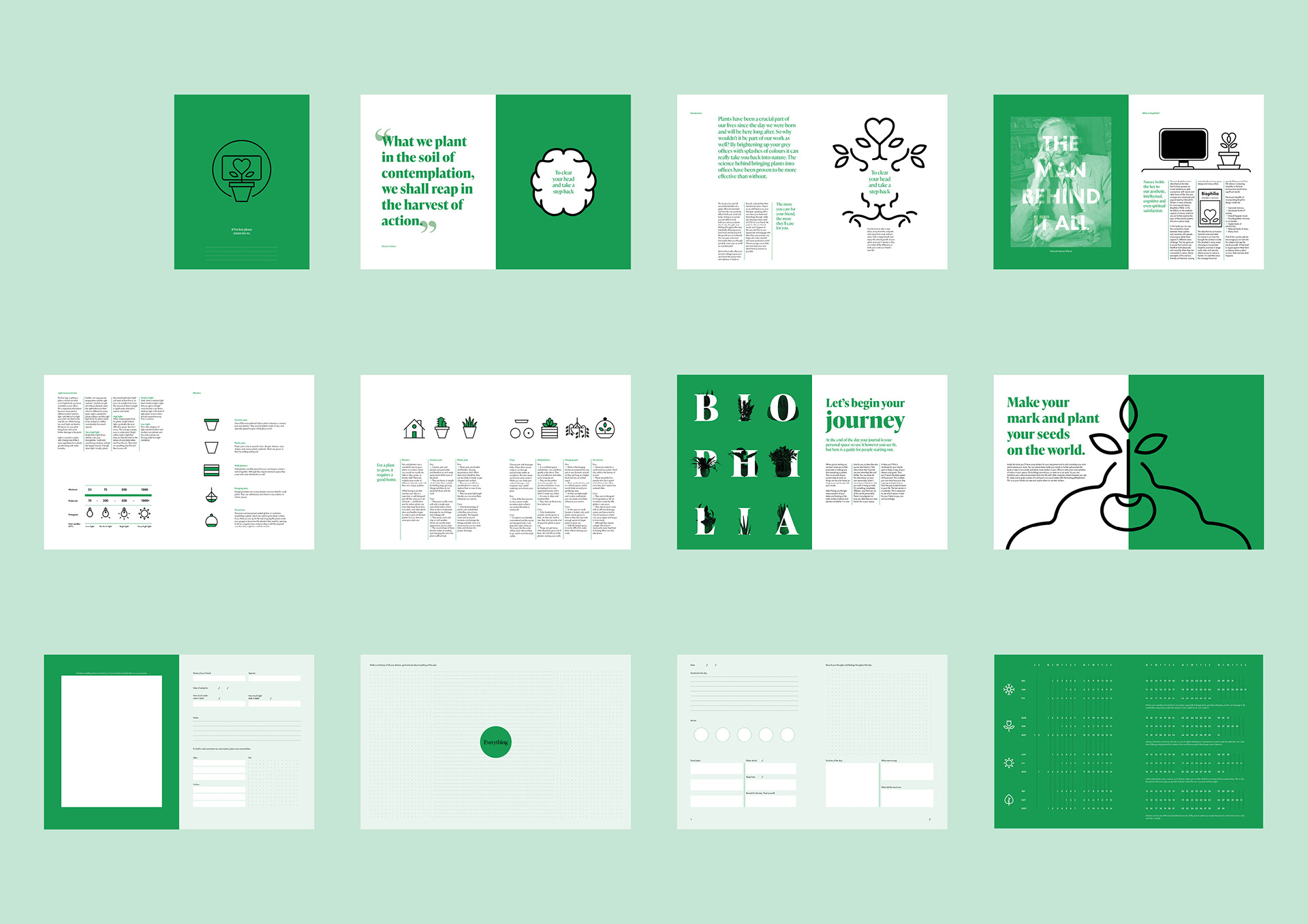
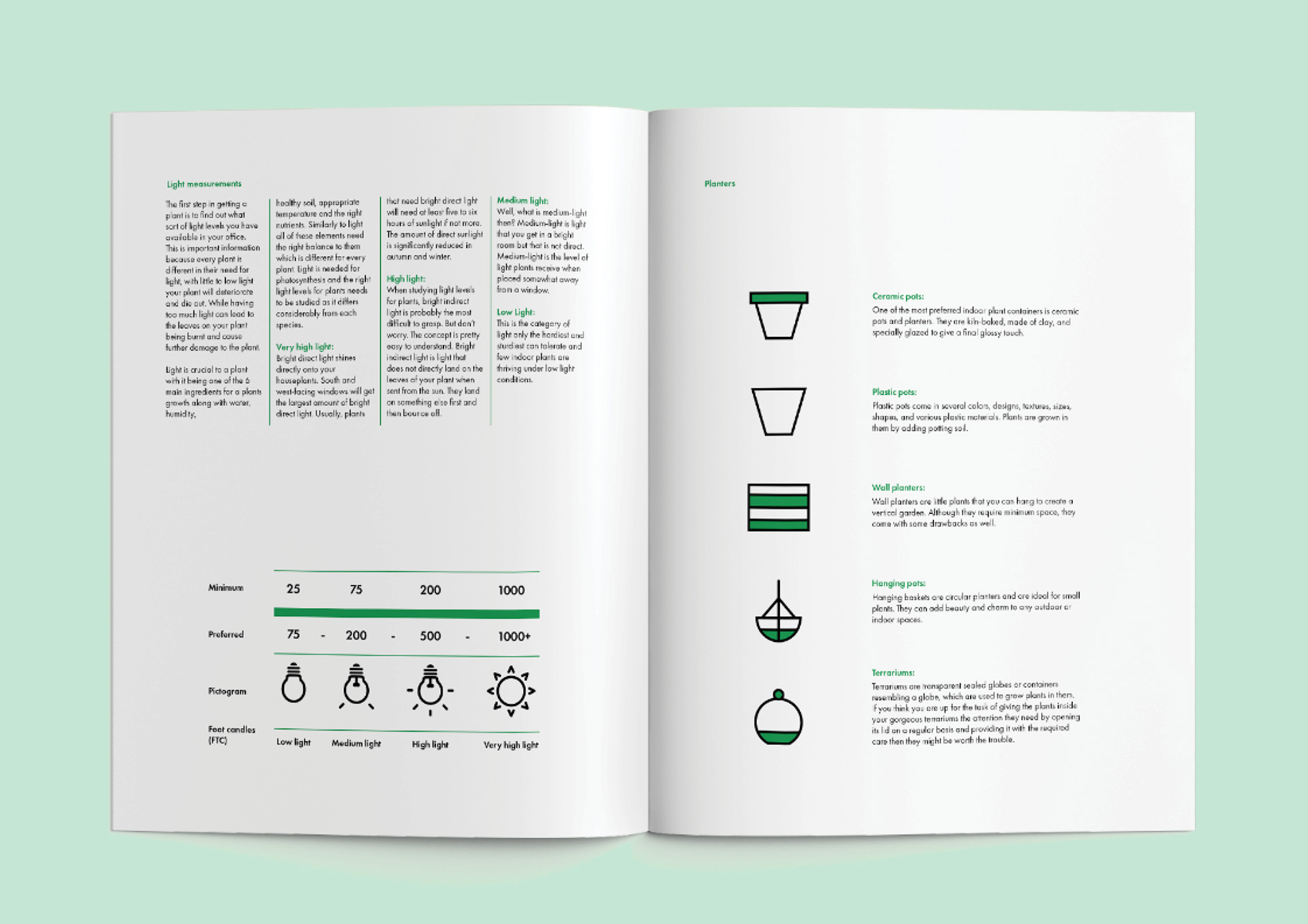
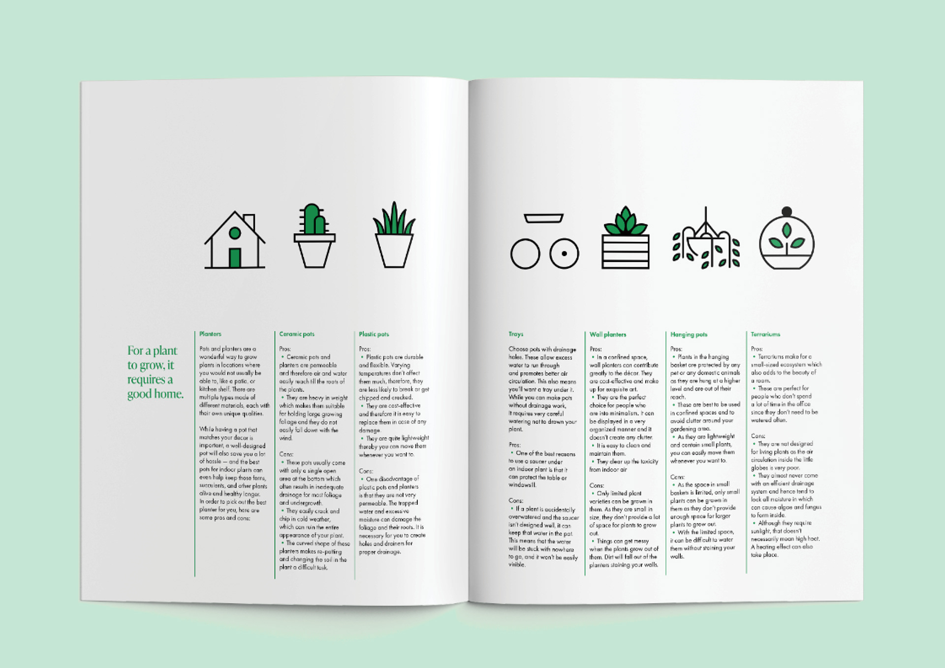
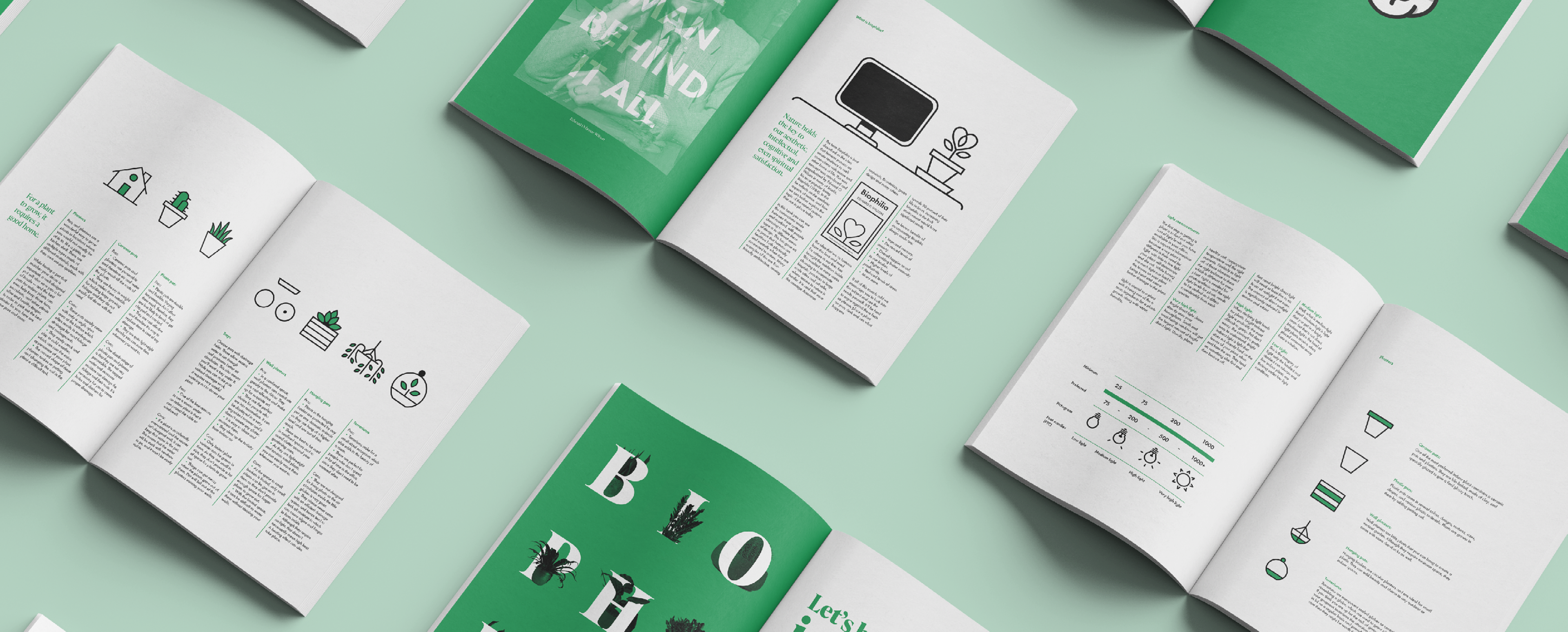
When designing my spreads I wanted to challenge myself by only giving myself the option of only having two tones. I decided on green and black with white coming from the paper as it suited the subject matter the books discussing.
This presented many issues with the main problem centred around the distinction between informational pages and journal pages. I resolved these issues by lowering the opacity of the green on journal pages to keep in line with the dual tones aesthetic.
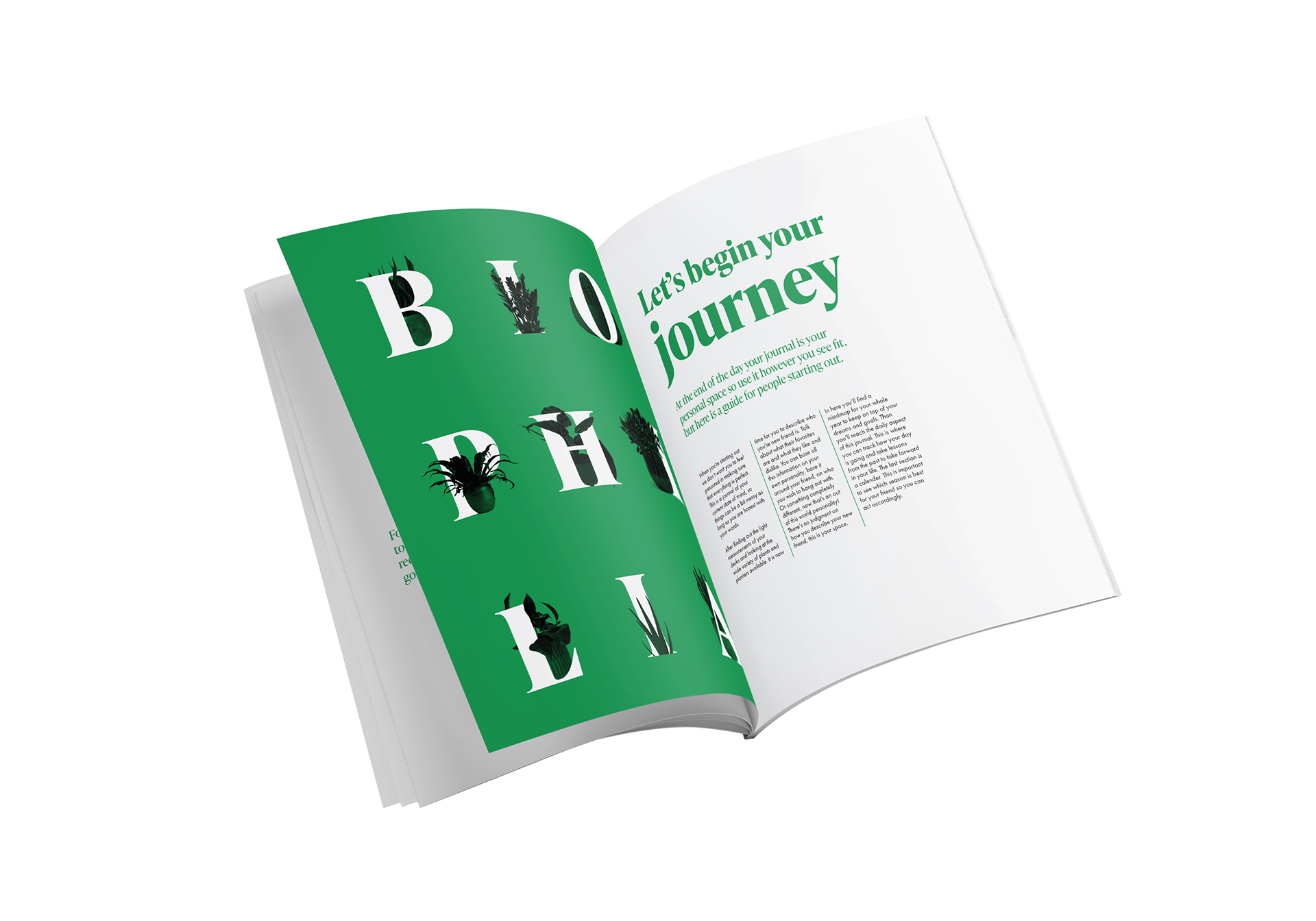
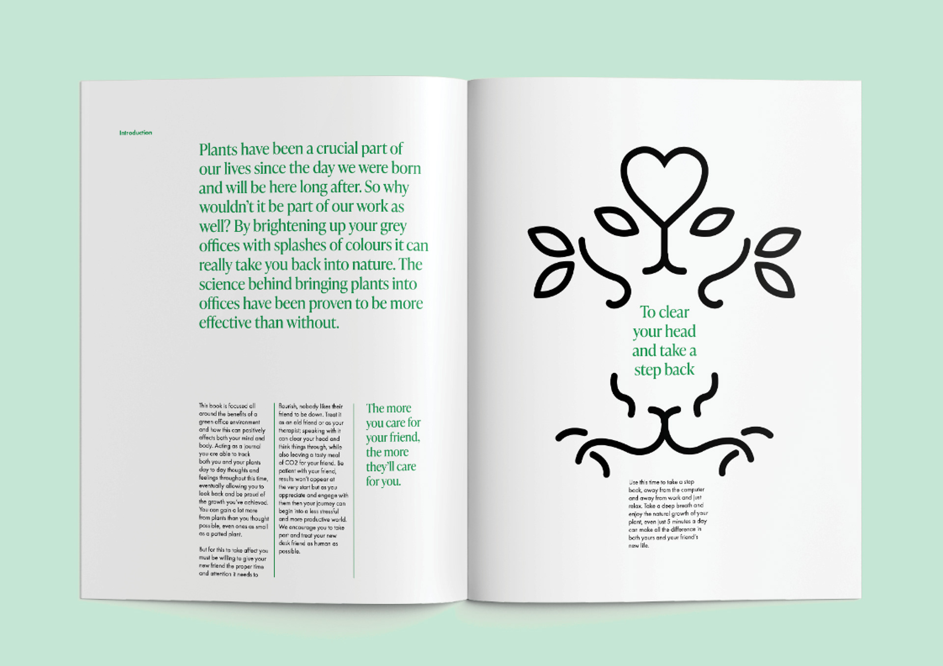
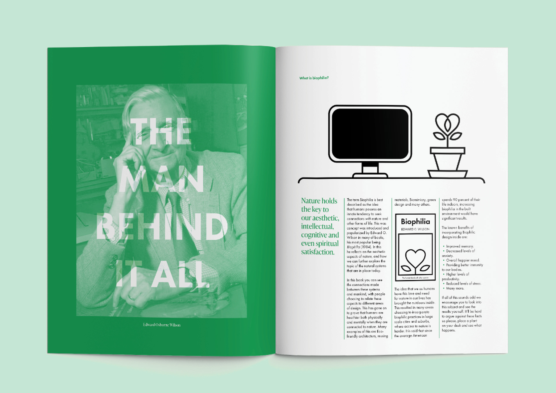
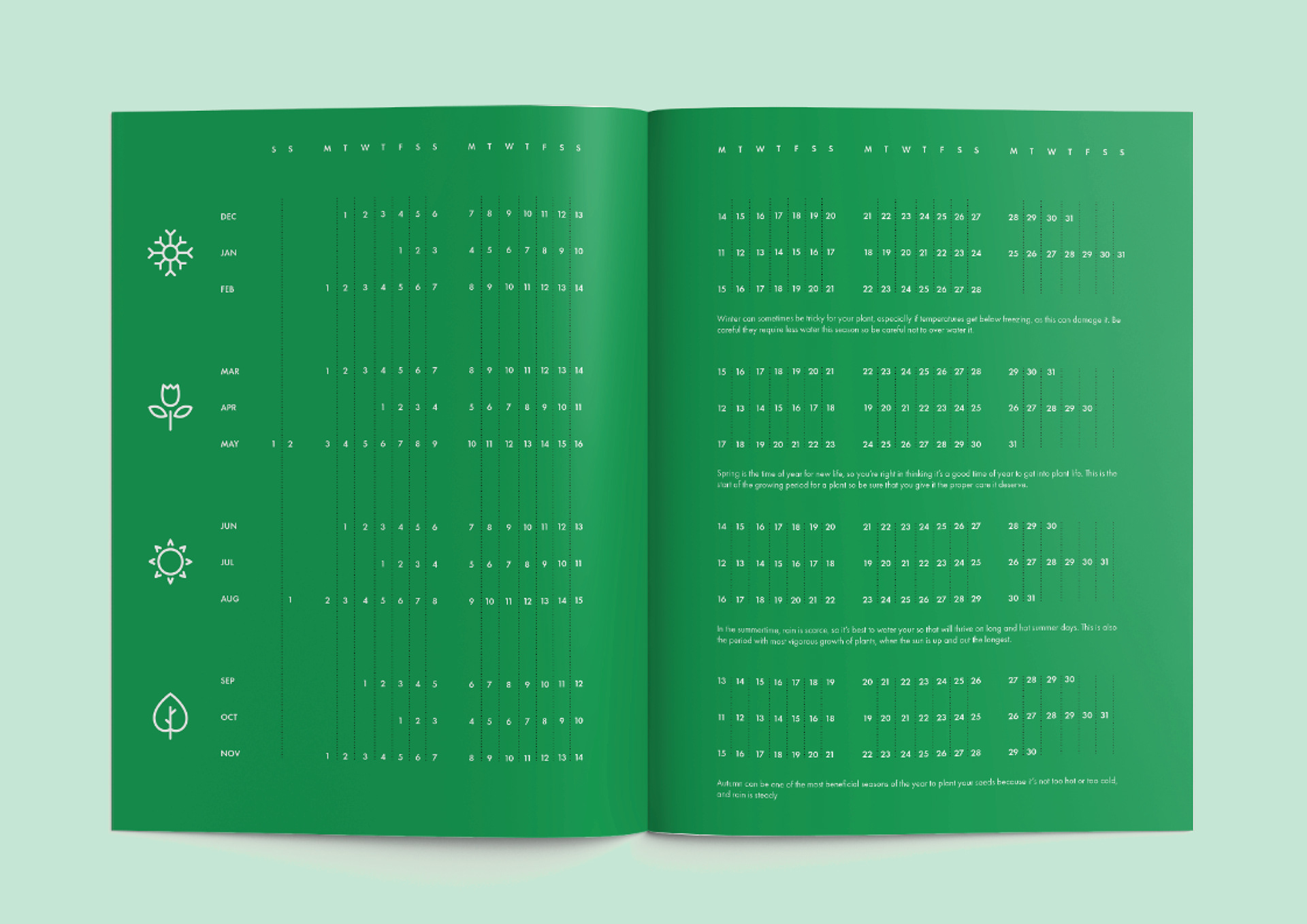
The design of the book can be split up into two parts with the first section discussing the concept of what Biophilia is as well as examining a diverse set of plants that would be best suited to your environment.
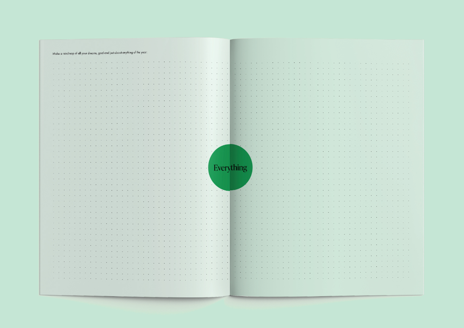
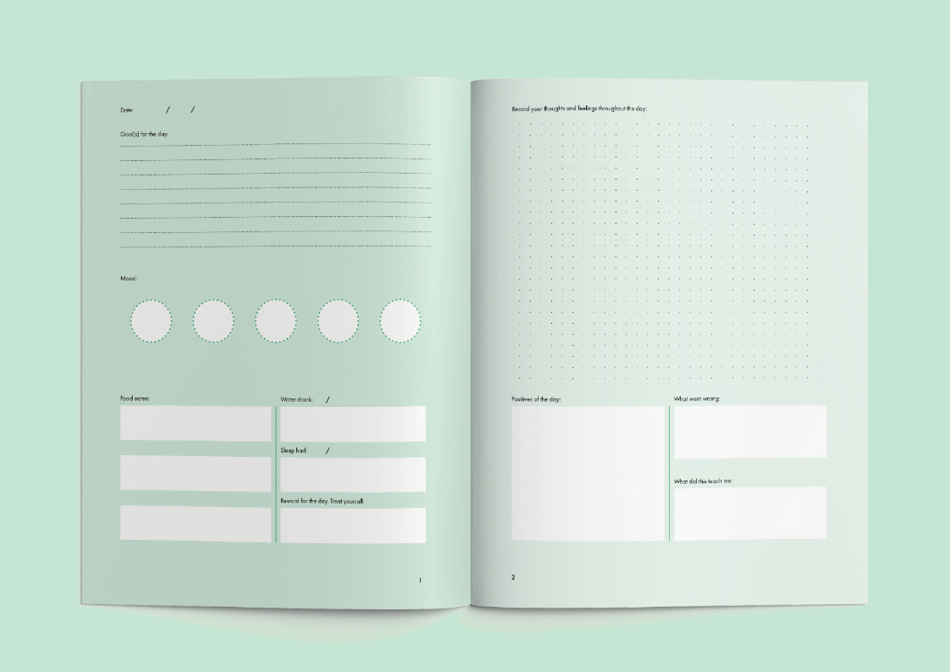
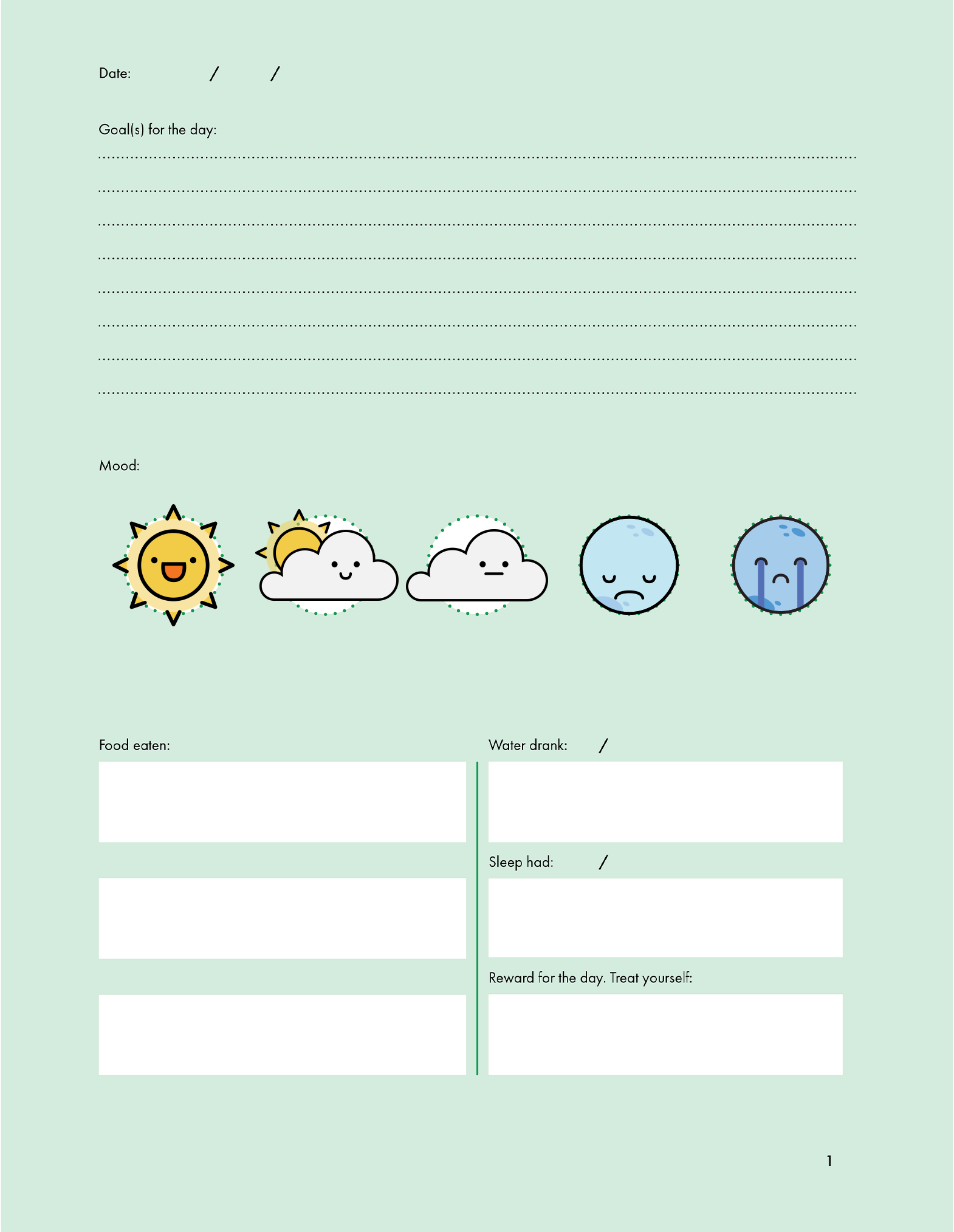
The second part can be identified as a wellness journal, where you can keep track of your mental health and provide some insight into your life that you can look over again and again.
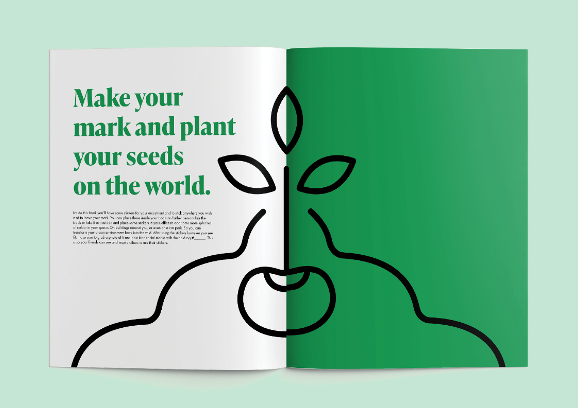
In here there is also a sticker pack that can be placed in or outside the journal that you can post along with the #Deskfriend to spread the word. In addition to this, there’s also a concertina booklet that can act as postcards to connect you people outside of your desk.


Here are the designs for the stickers I created, to be used to track your mood or outside of your journal. I had two objectives when I was designing my stickers:
First I wanted the designs to reflect 5 emotions: great, happy, neutral, bad, terrible.
The second objective was to remind audiences of the world outside the office which led to the main concept of these stickers, with the theme of cycles in the sky.
The point of this is activity is to keep track of the emotions you are feeling to possibly identify a pattern that's causing you either grief or happiness. Allowing the audience to act according to this new information in mind.
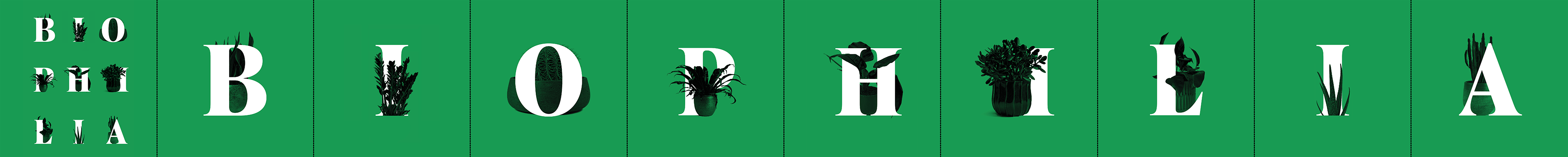
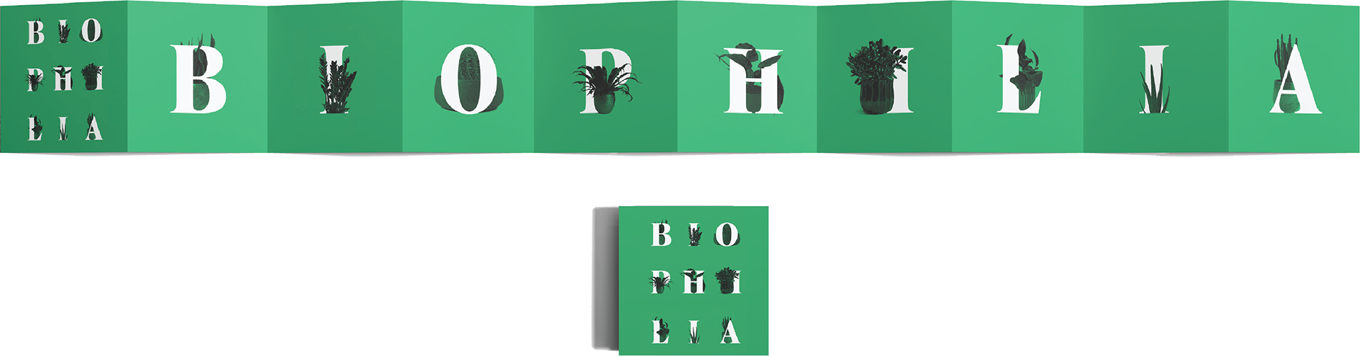
Inside the journal, I included a concertina booklet that audiences can take out and use as either a postcard to send off or to just look at as a piece of design. The focus of this idea behind this is to reconnect audiences with people away from their desk, which provides more of a personal element to connecting to people rather than just a simple email.