
For this brief, I was tasked to design a 32pp book around a chosen piece of text which would need to be French folded. I would need to screen print a design that reflected the themes presented in the book onto a dust jacket that needed to fit perfectly around the book, in addition to this I would need to bind my book using whichever method suited the book's concept.
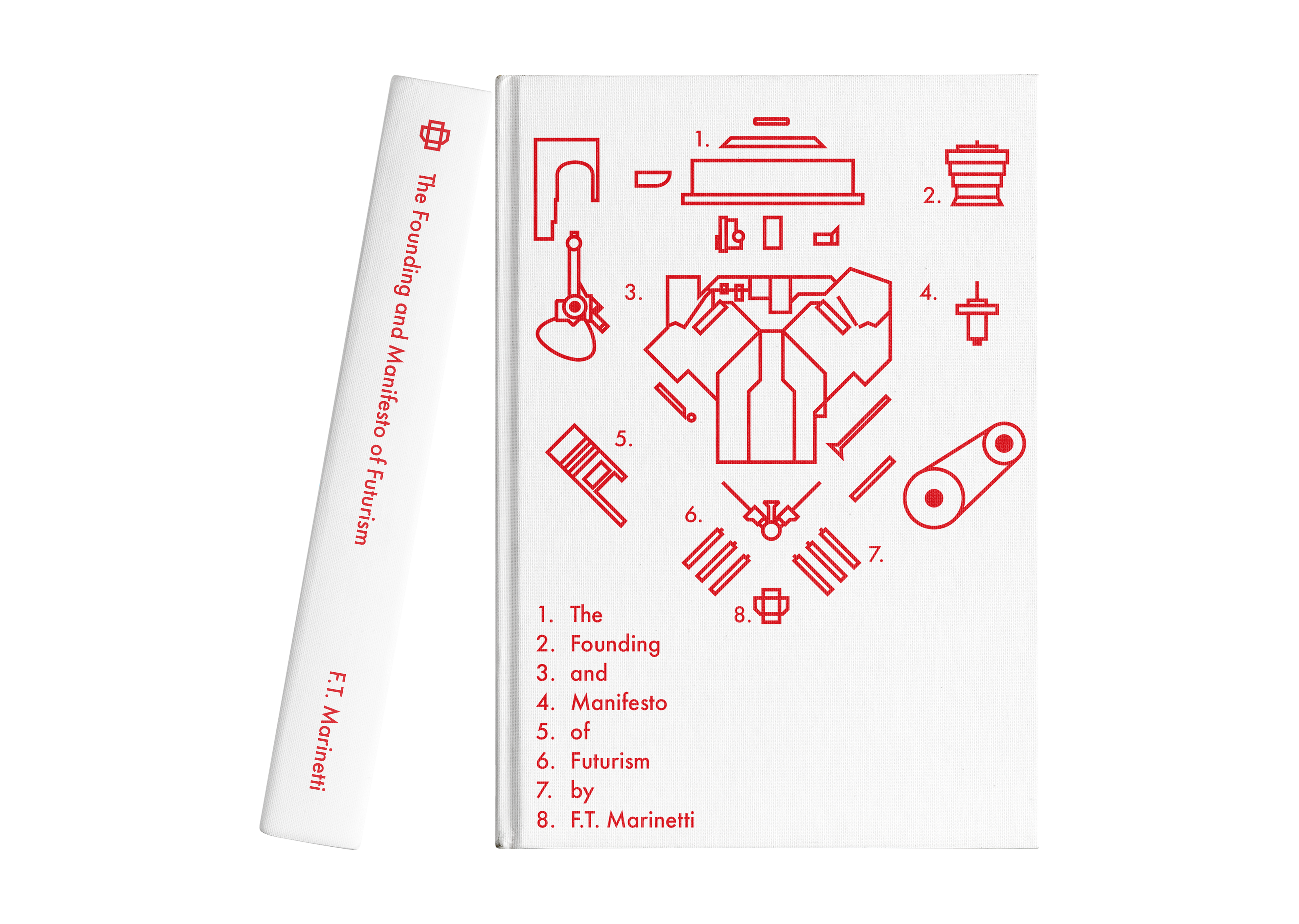
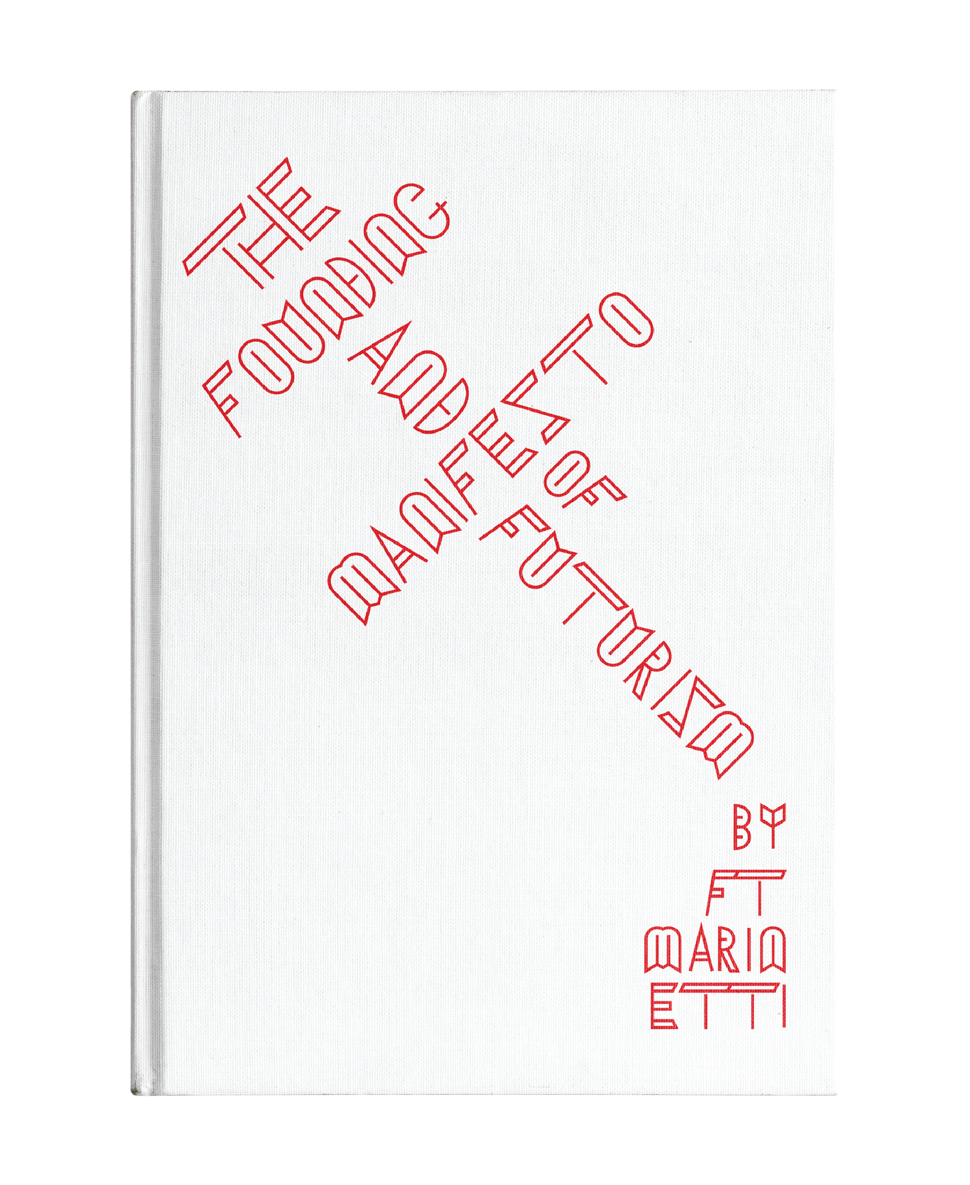
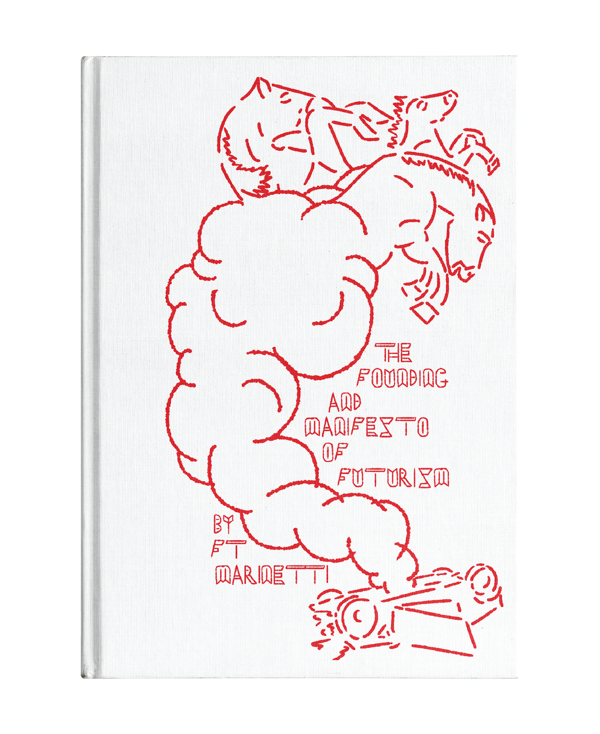
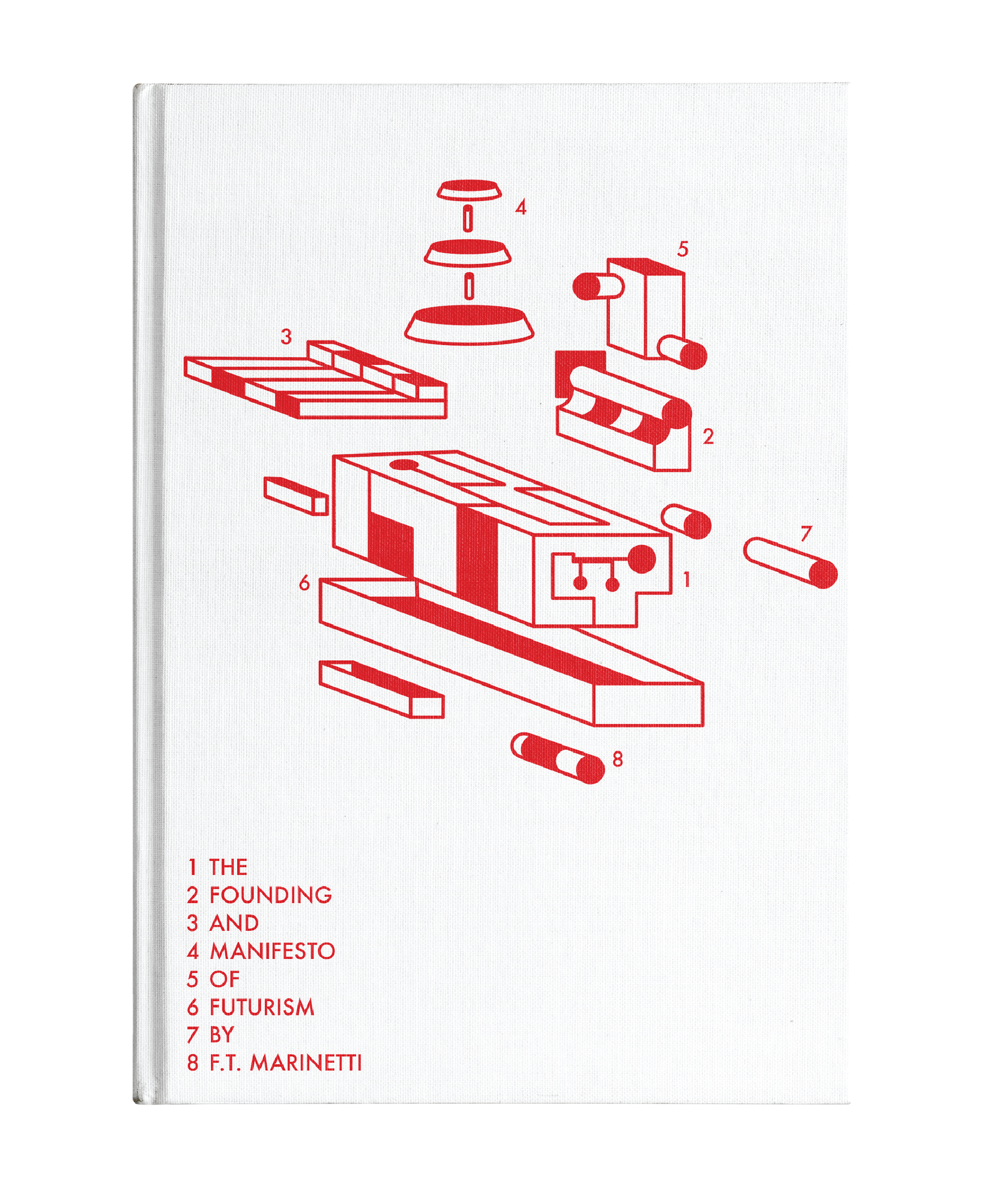
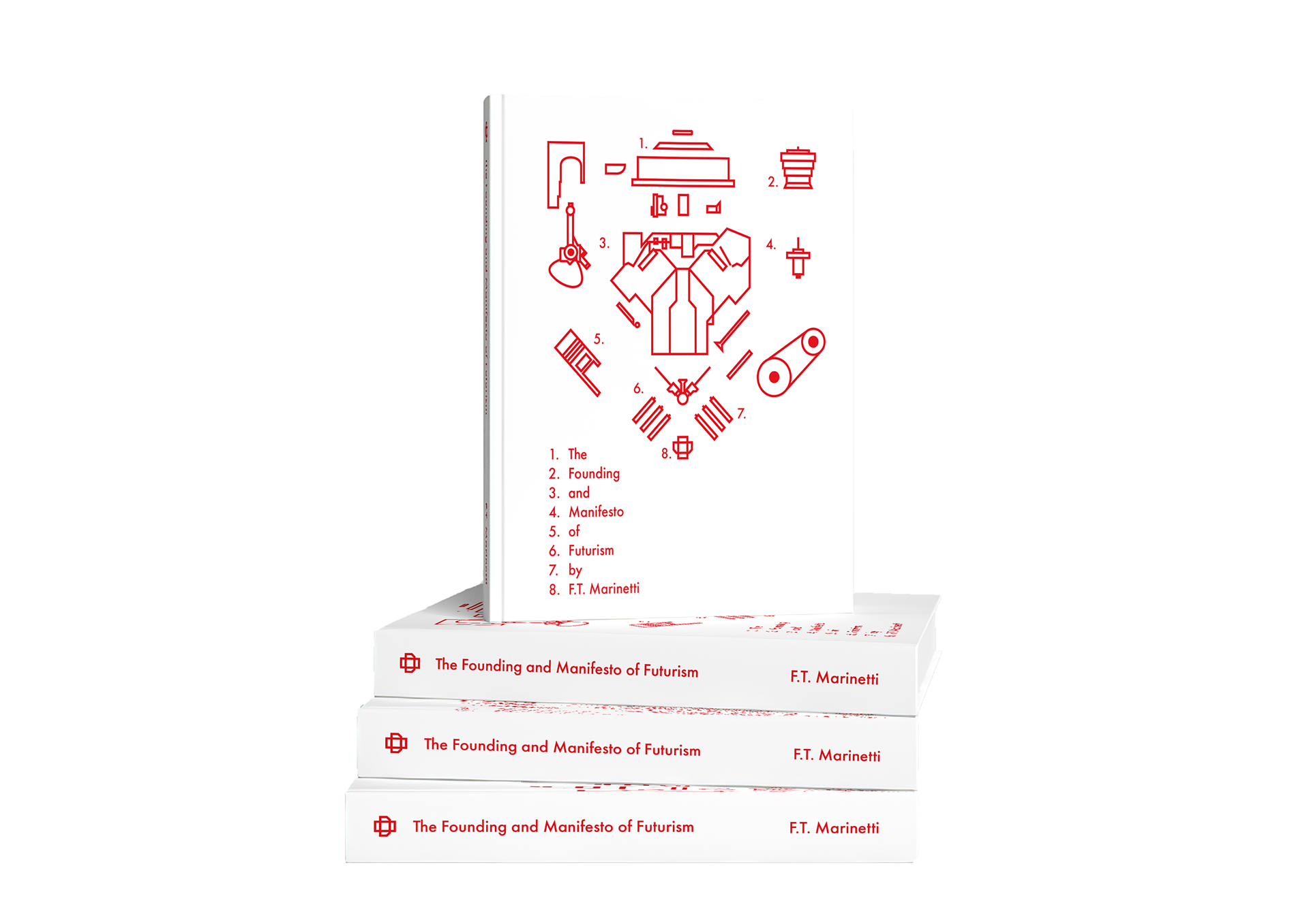
For my front cover, I chose red as it was a prominent colour that was used in many futurism artworks so I wanted to refer to the history that futurism has had. In addition, the red stood out against the off-white dust jacket and added a splash of colour to make it more visually appealing.

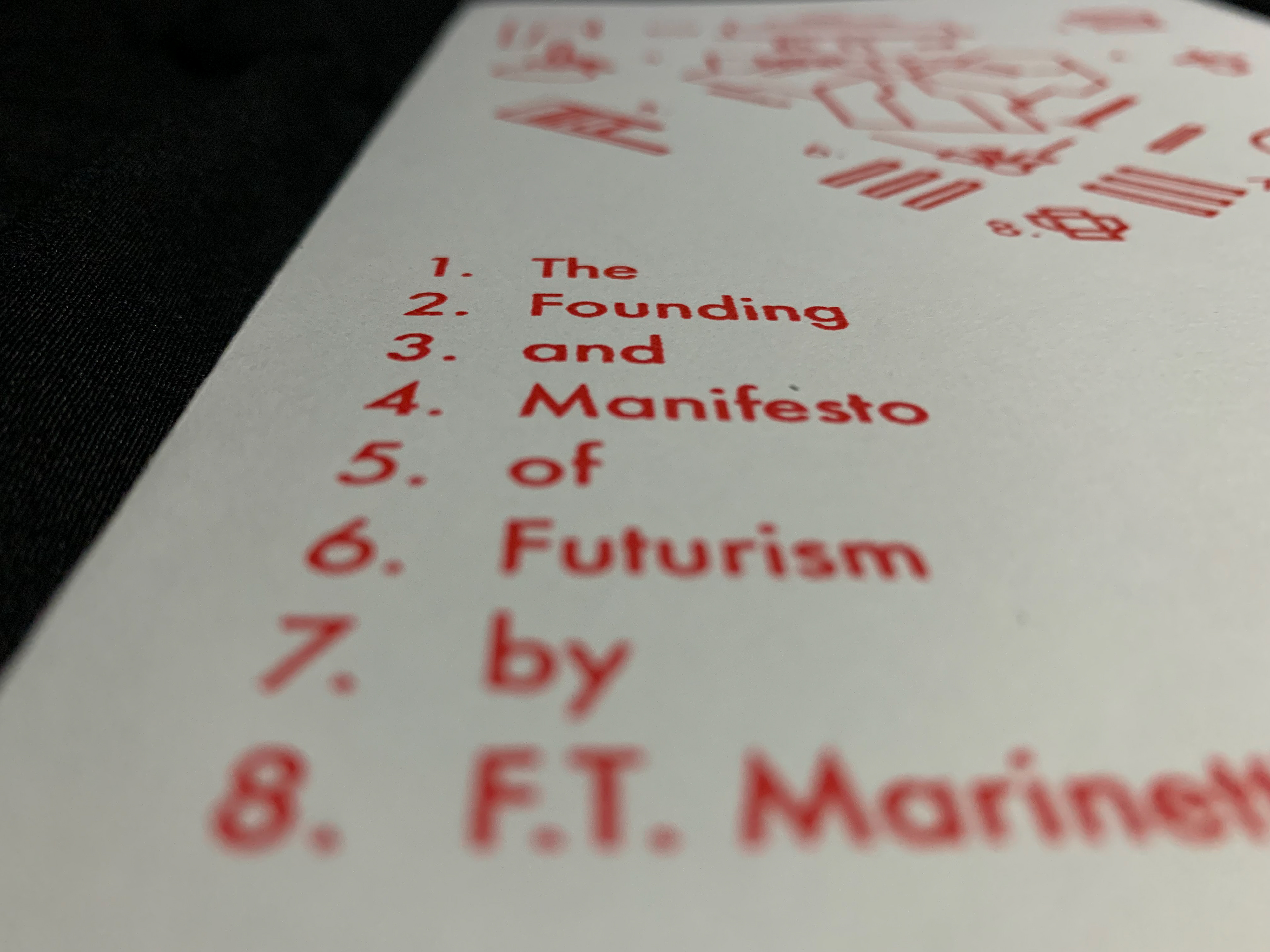
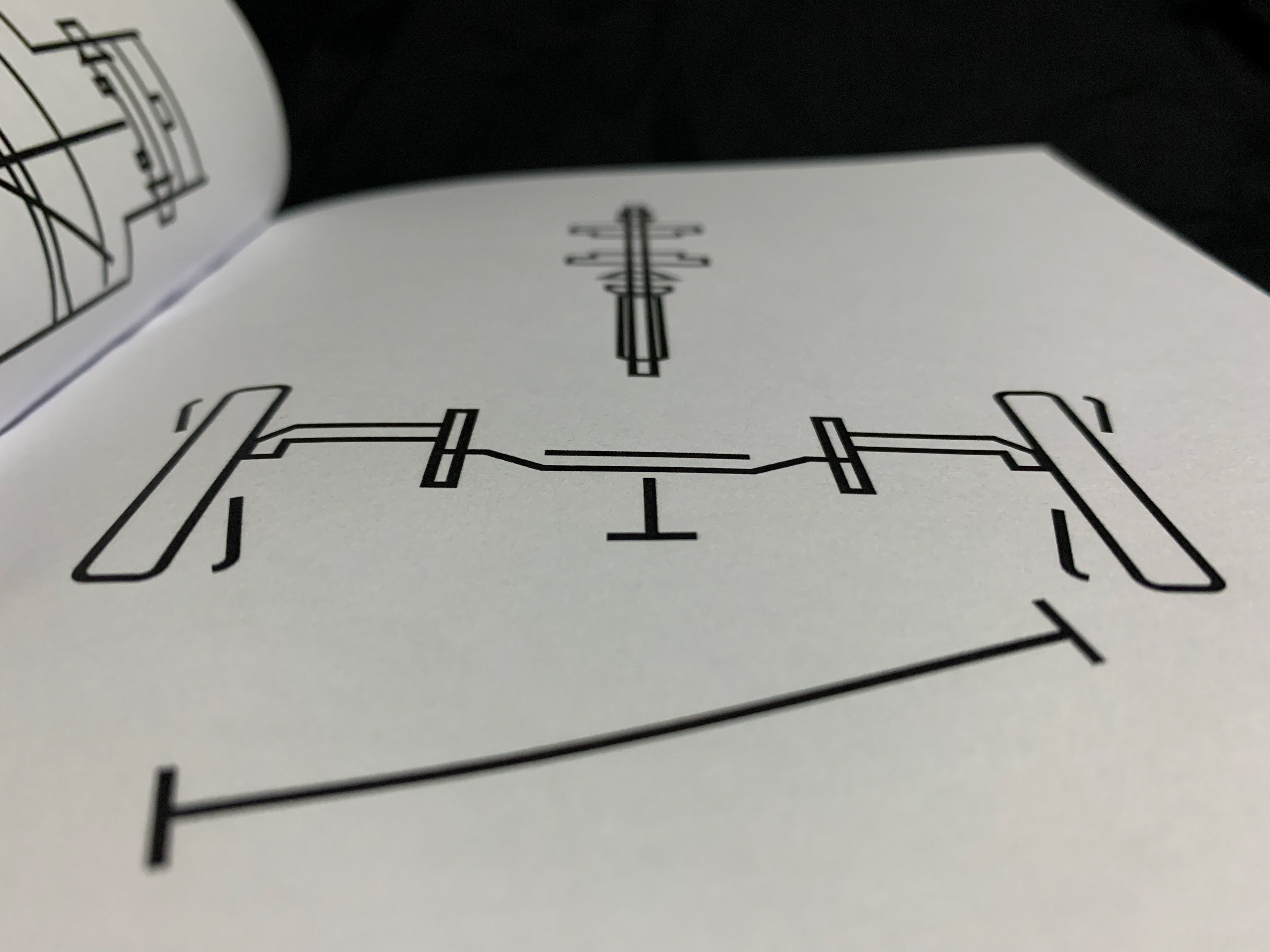

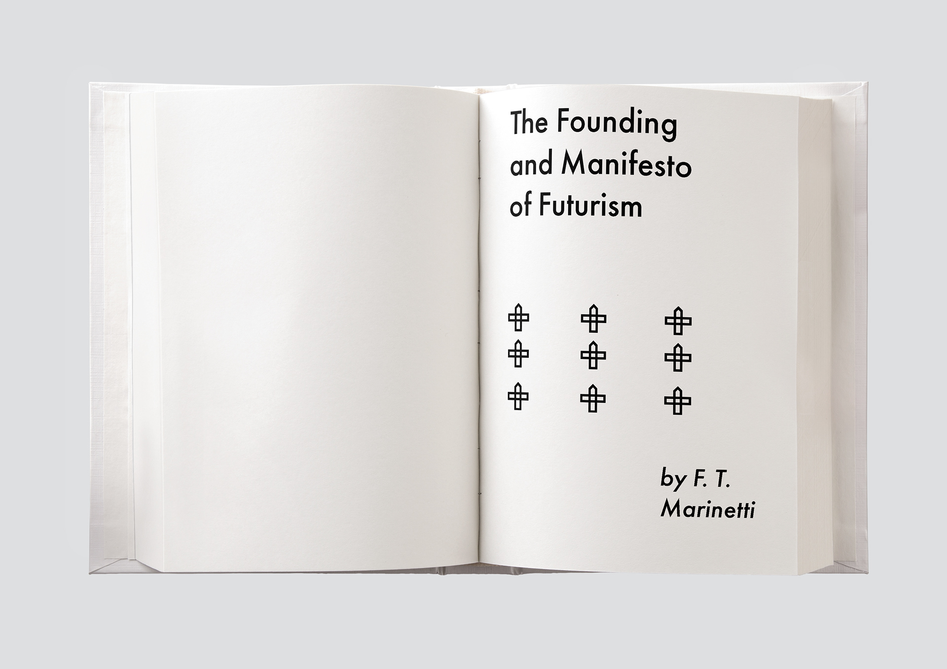
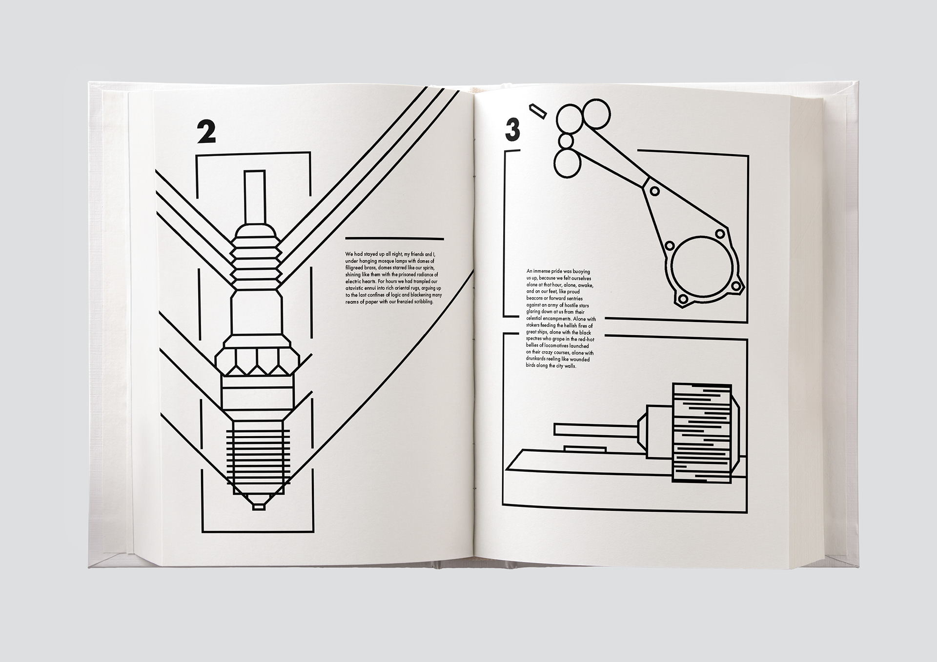
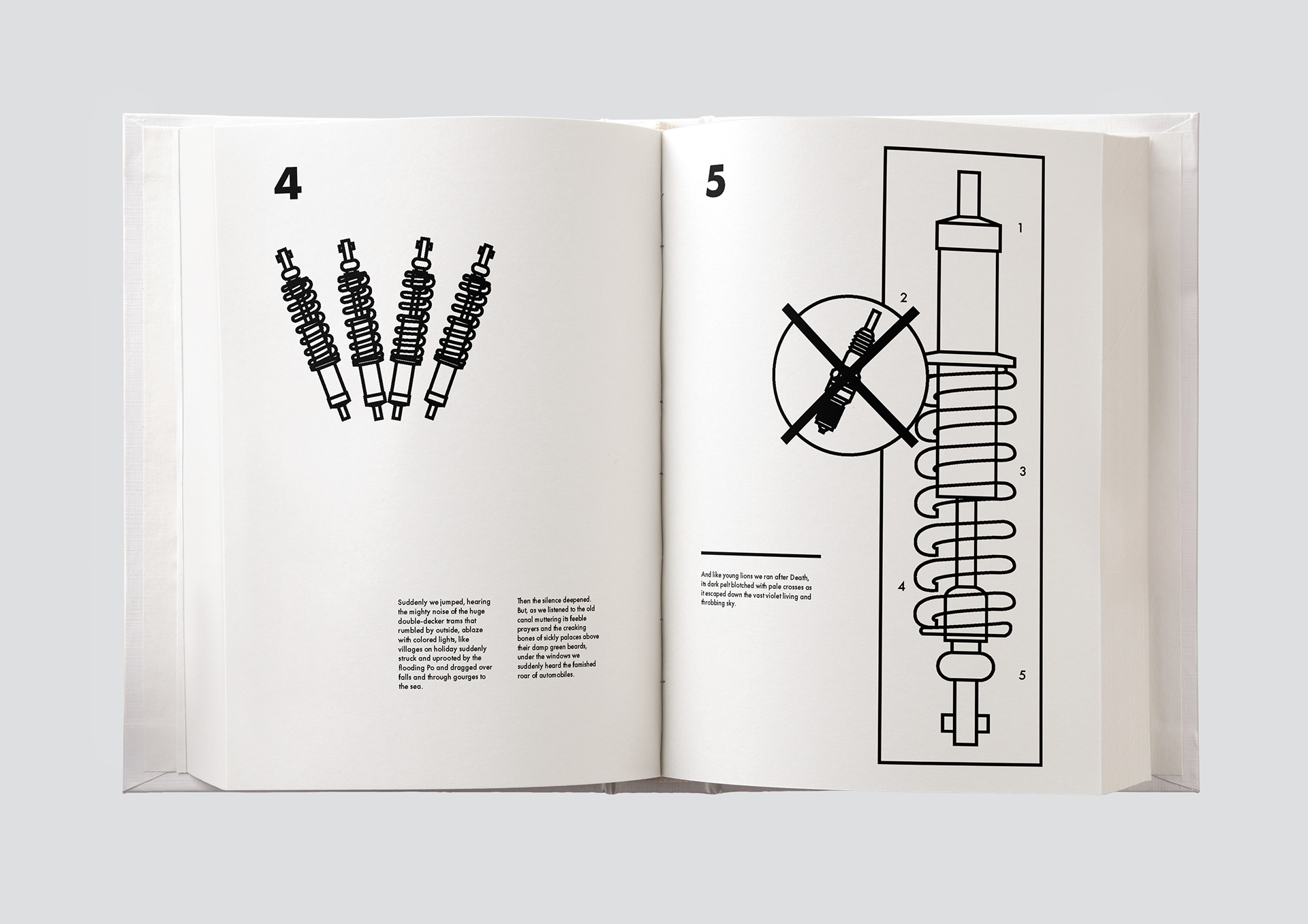
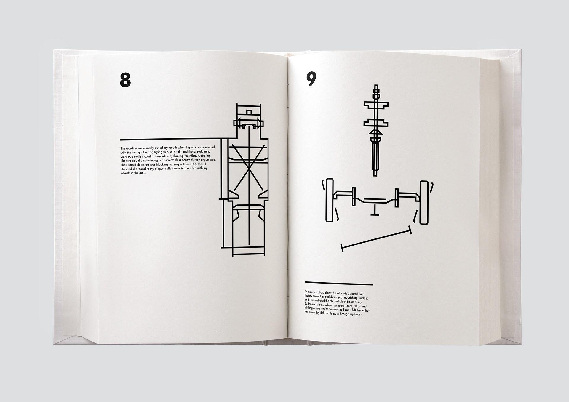
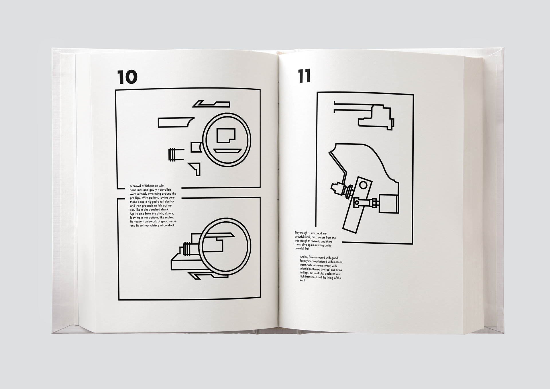
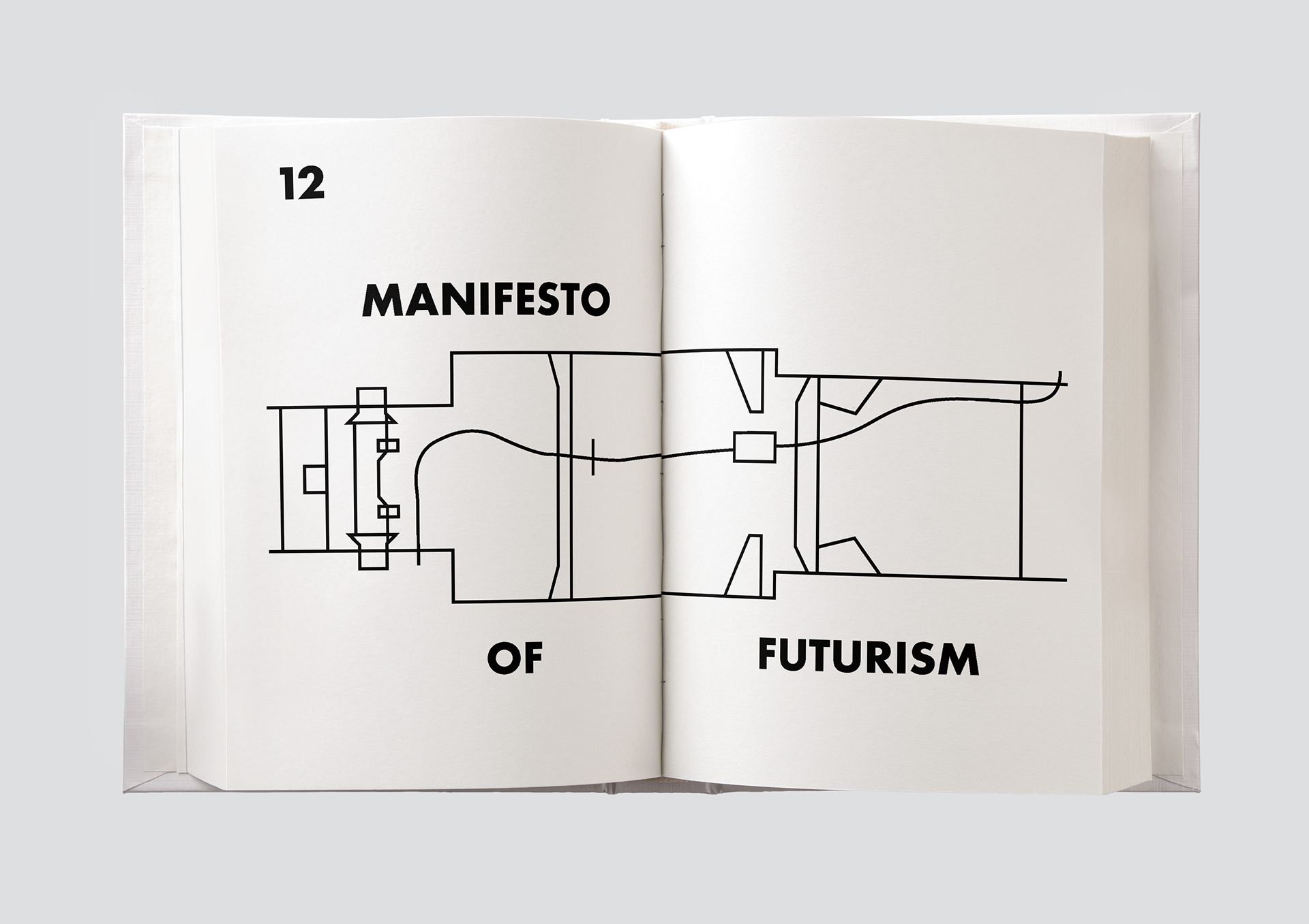
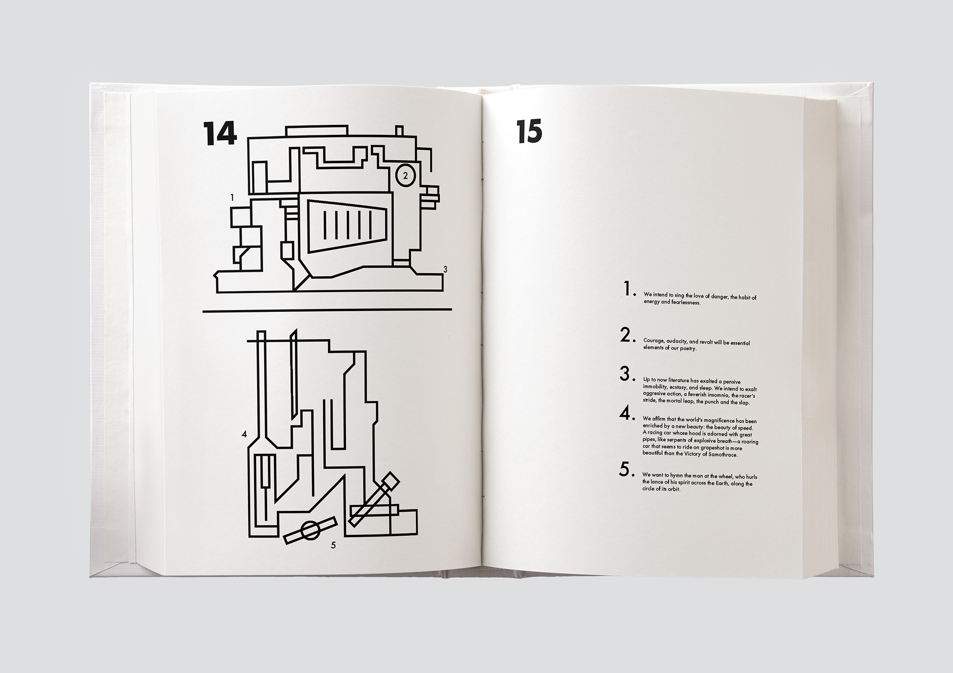
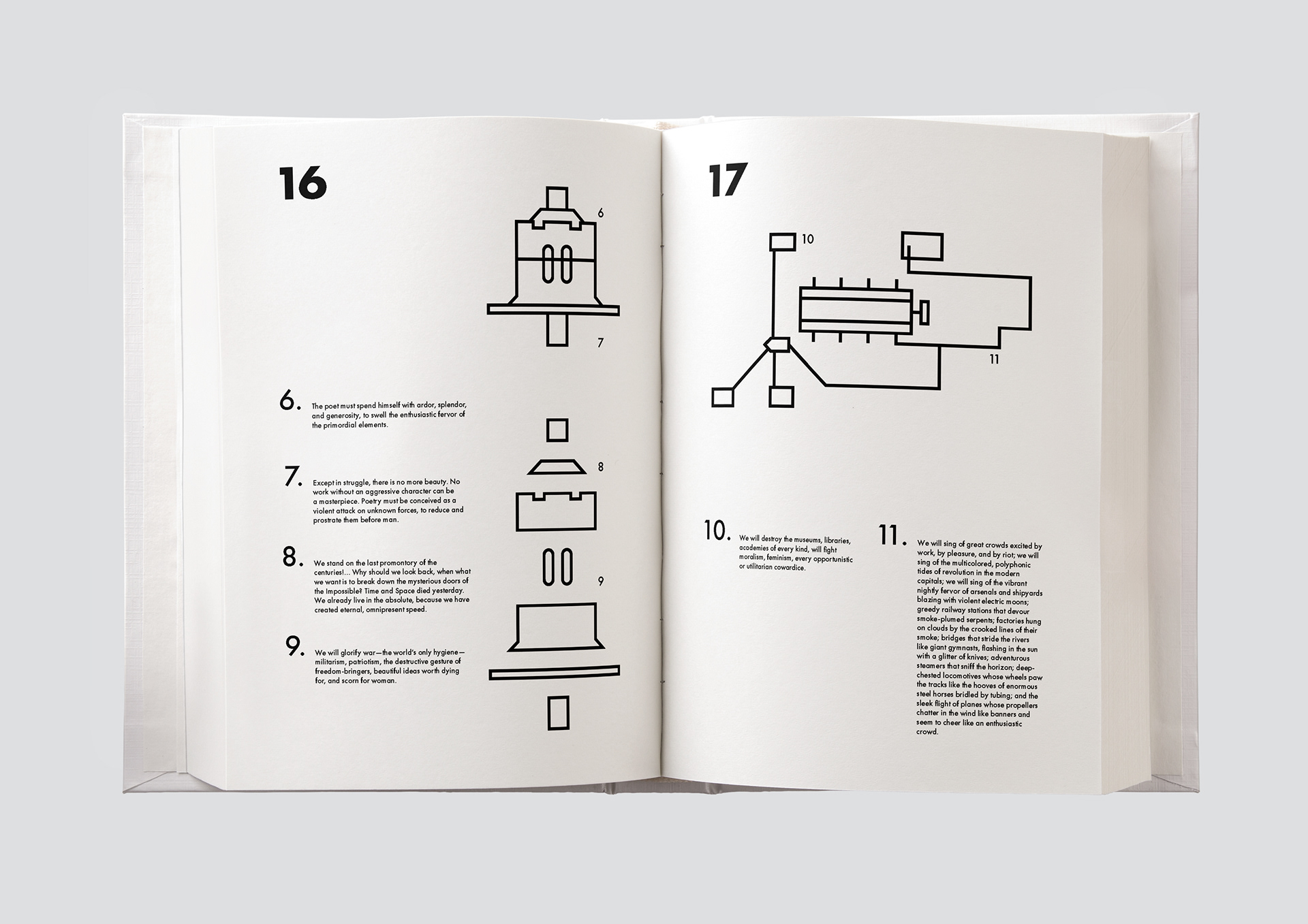
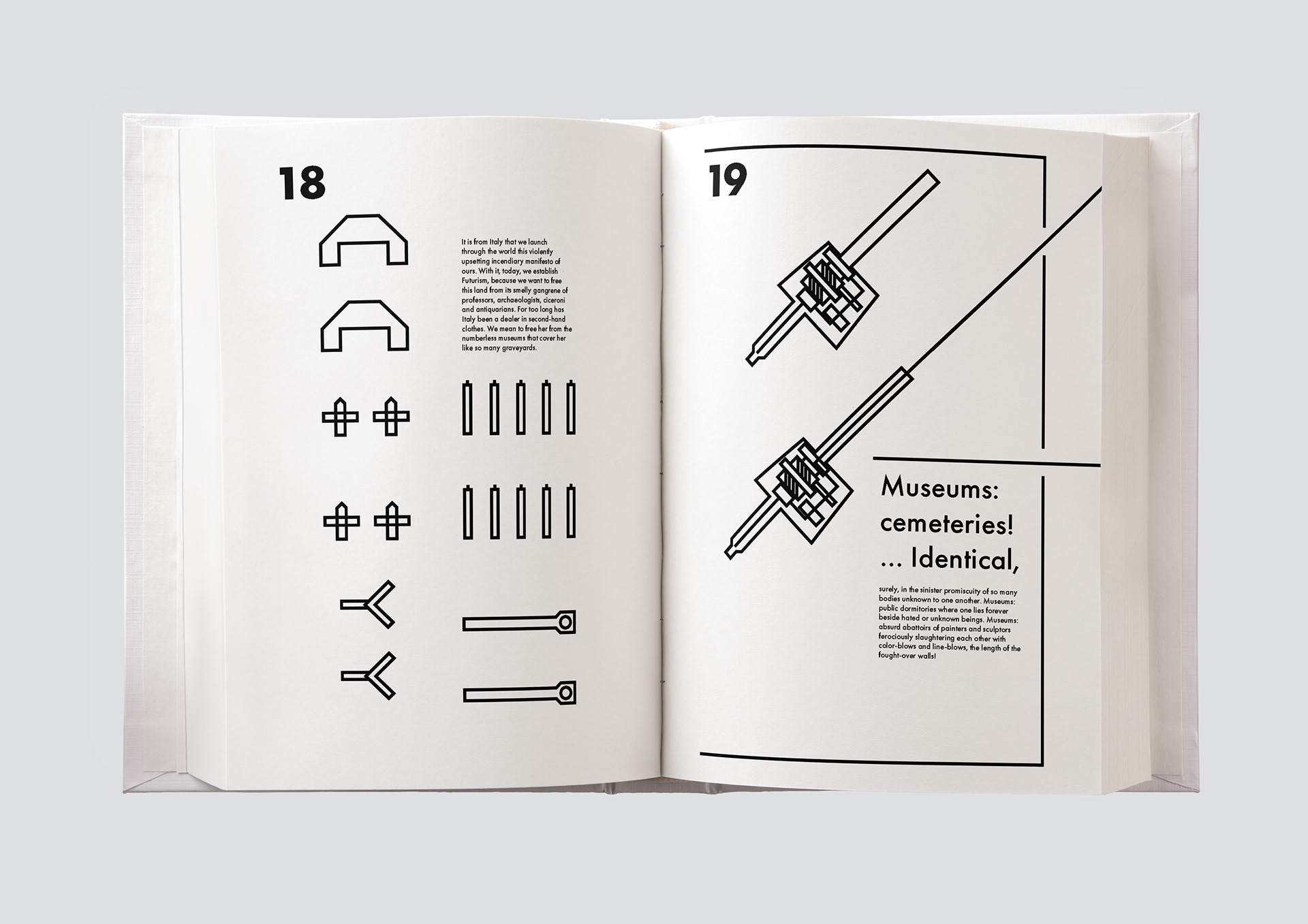
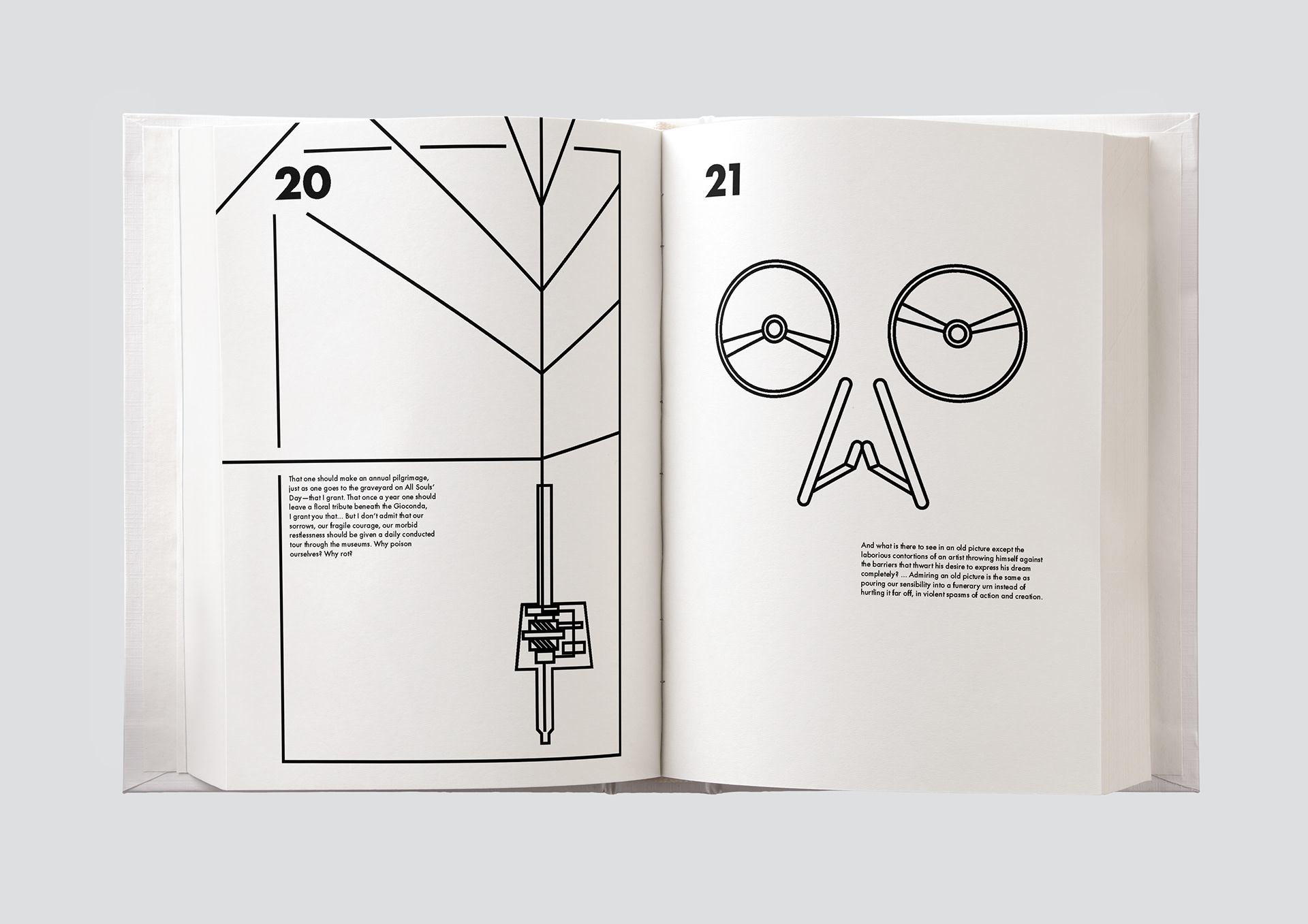
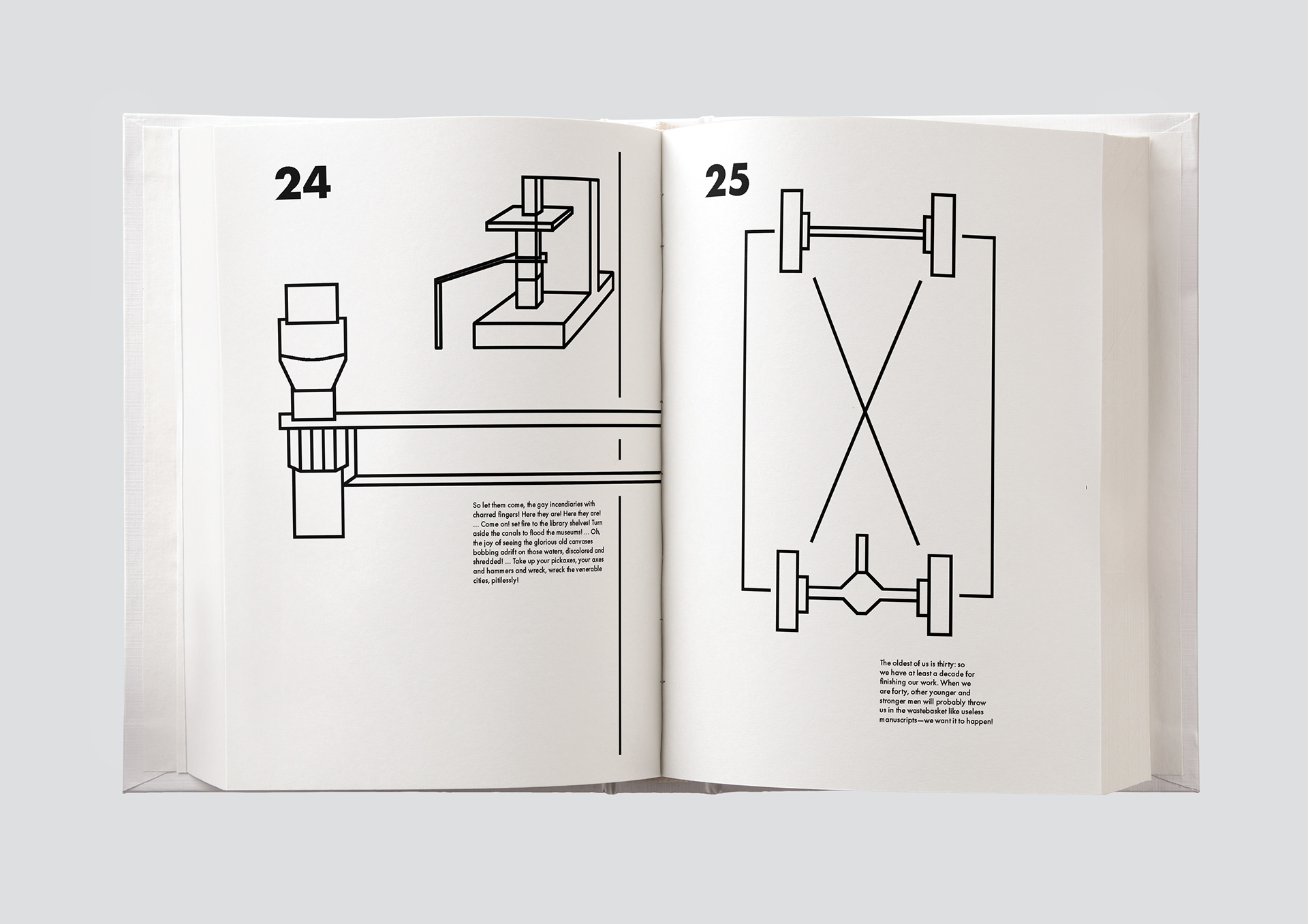
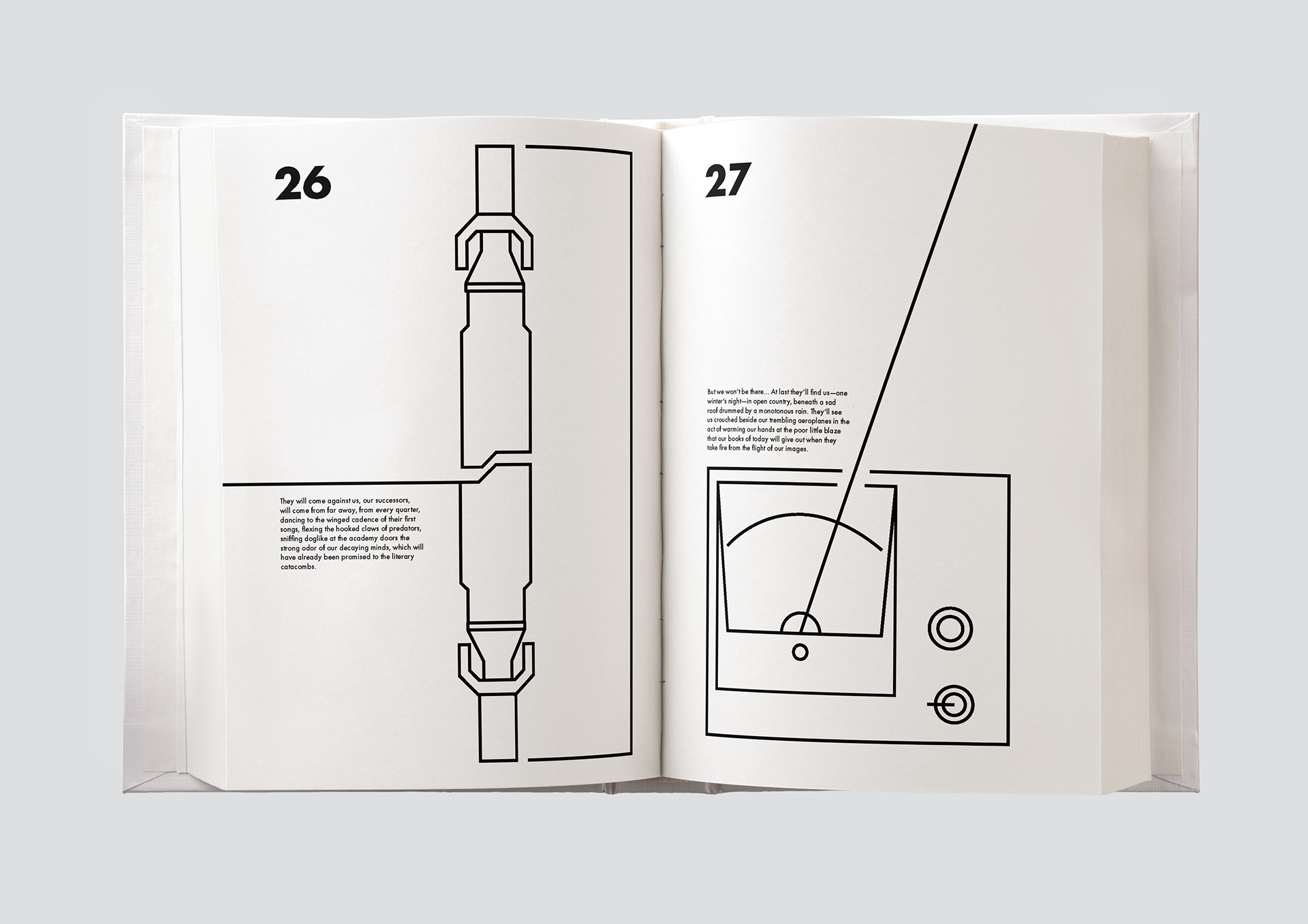
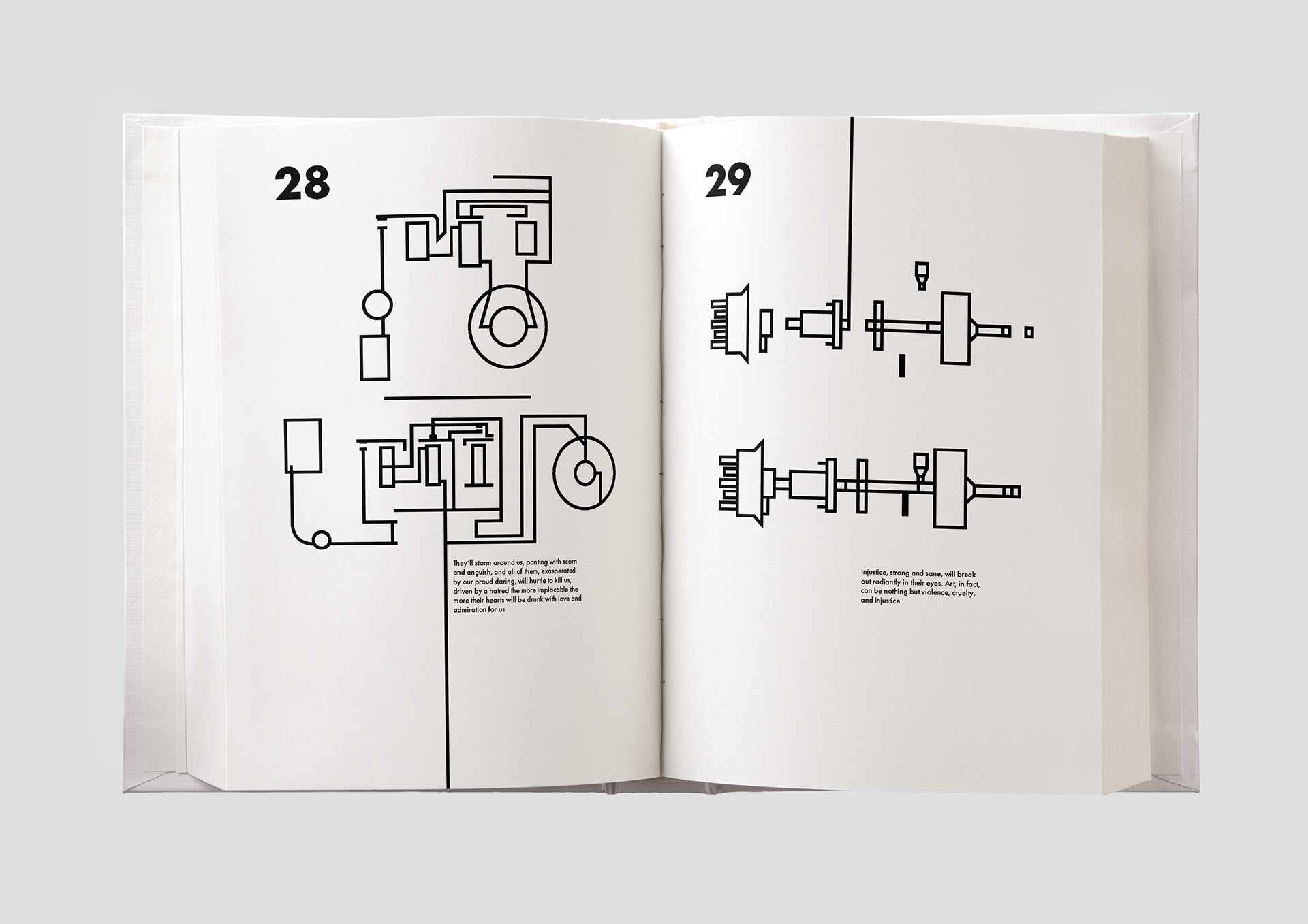
The book design is based around the text from The Founding and Manifesto of Futurism by F.T. Marinetti. The design represents the qualities of Futurism through their love of cars. It reflects a car manual and the idea of learning and understanding what the foundation of Futurism is. This suited the white and black restrictions as the style of the manual was based around IKEA manuals.
For my main typeface, I decided to go with Futura due to its geometric features, specifically the "O" since it feels fluid and contrasts the sharp edges on some of the other letters, lending itself perfectly to the futurism manifesto as well as fitting with the overall aesthetic of the book.


Below are a few alternate front covers for the book that I didn't take any further as they didn't fit with the theme or narrative I was creating with the book's design.