
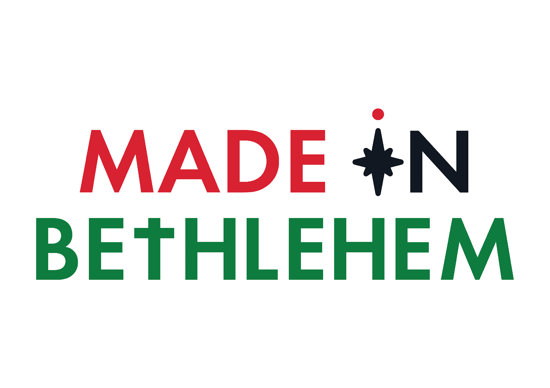
Made in Bethlehem is a small trade not-for-profit business, run by Mike Truman, that sells imported religious artefacts that are handmade by local artisans in Bethlehem. For this rebrand, Mike wanted a modern approach to his brand that was clean and simple. This included a logo, colour scheme, type choices and a identify guide that would reflect the changes in his brand.
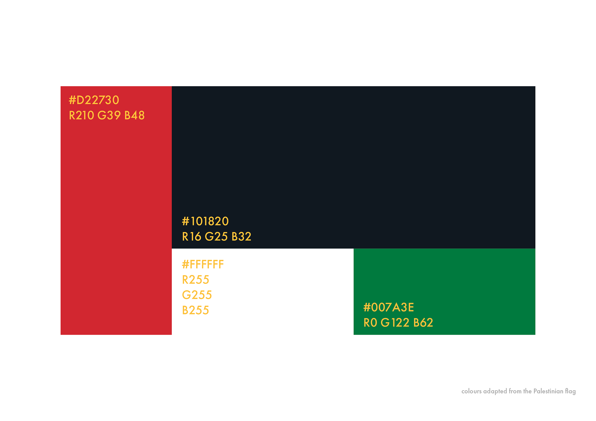
When speaking with Mike his passion towards the Palestinian craftspeople that he works closely with became very evident. With this in mind, I wanted to make some form of reference to this, which he was very excited to hear about. I decided to adapt the colours used in the Palestinian flag to represent the people who put all their hard to create these products for you.

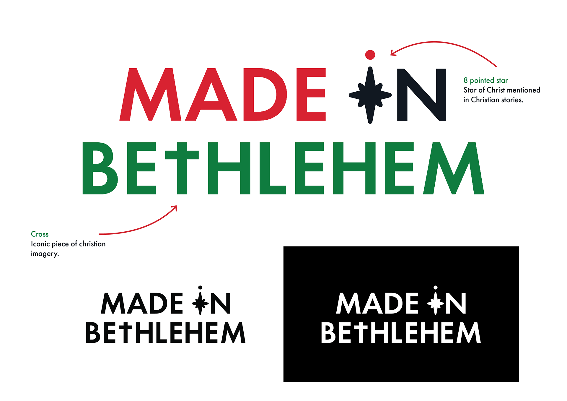
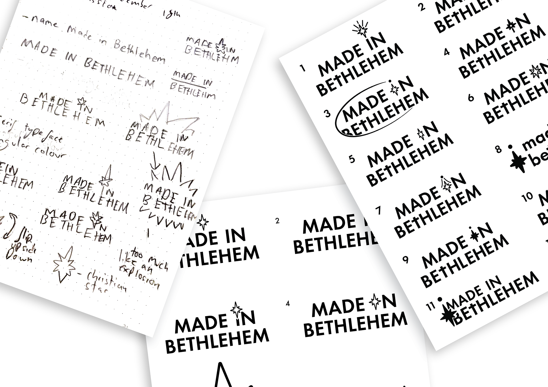
Here are a few sketches I've done that helped me come up with my idea. The inclusion of the 8 pointed stars in the type was crucial for the logo as I didn't want to isolate audiences who wouldn't understand the reference, but this detail adds the additional benefit for those who do understand.

From the logo, I simplified the design to be used for social media icons and I made sure to keep in mind the different shapes that are mostly used in social media. When talking with my client I also suggested the design be used as stickers for you to place on products to clearly show the association with the brand.

Here are some ways I applied the brand guideline to products so the client can visualise how the new brand will work. I used examples of products that he had sent me before to show him the change in designs to see if he liked the new direction his brand was heading.
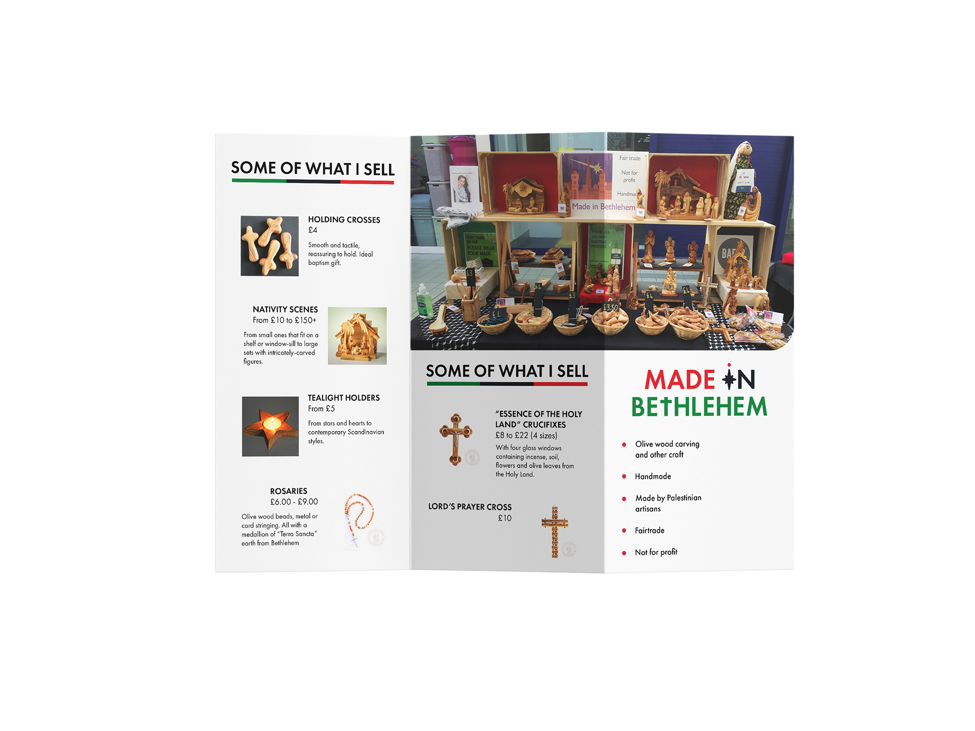
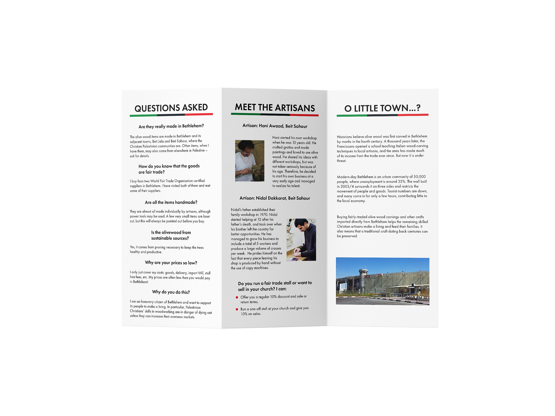
Leaflet redesign based on past leaflet example.

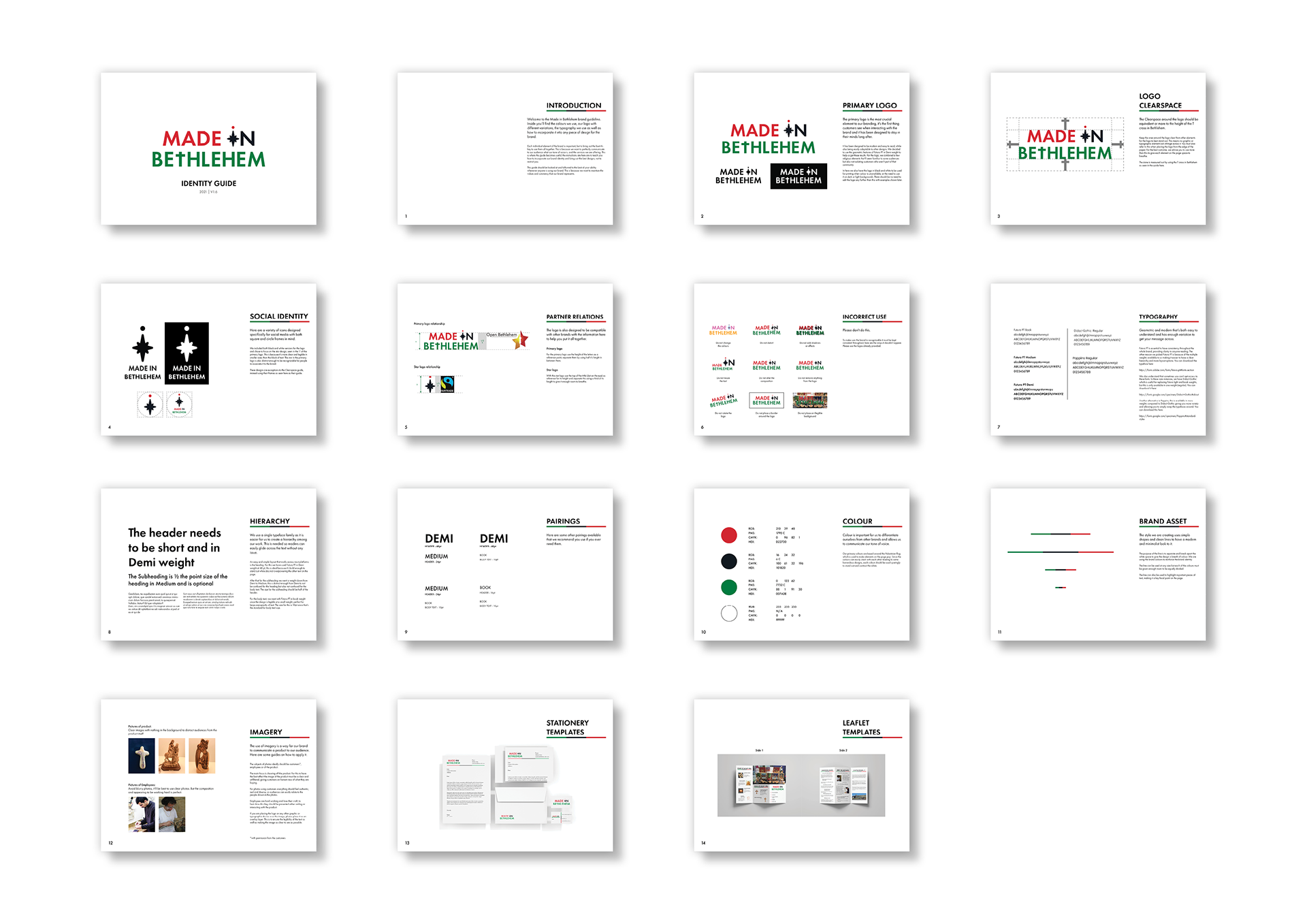
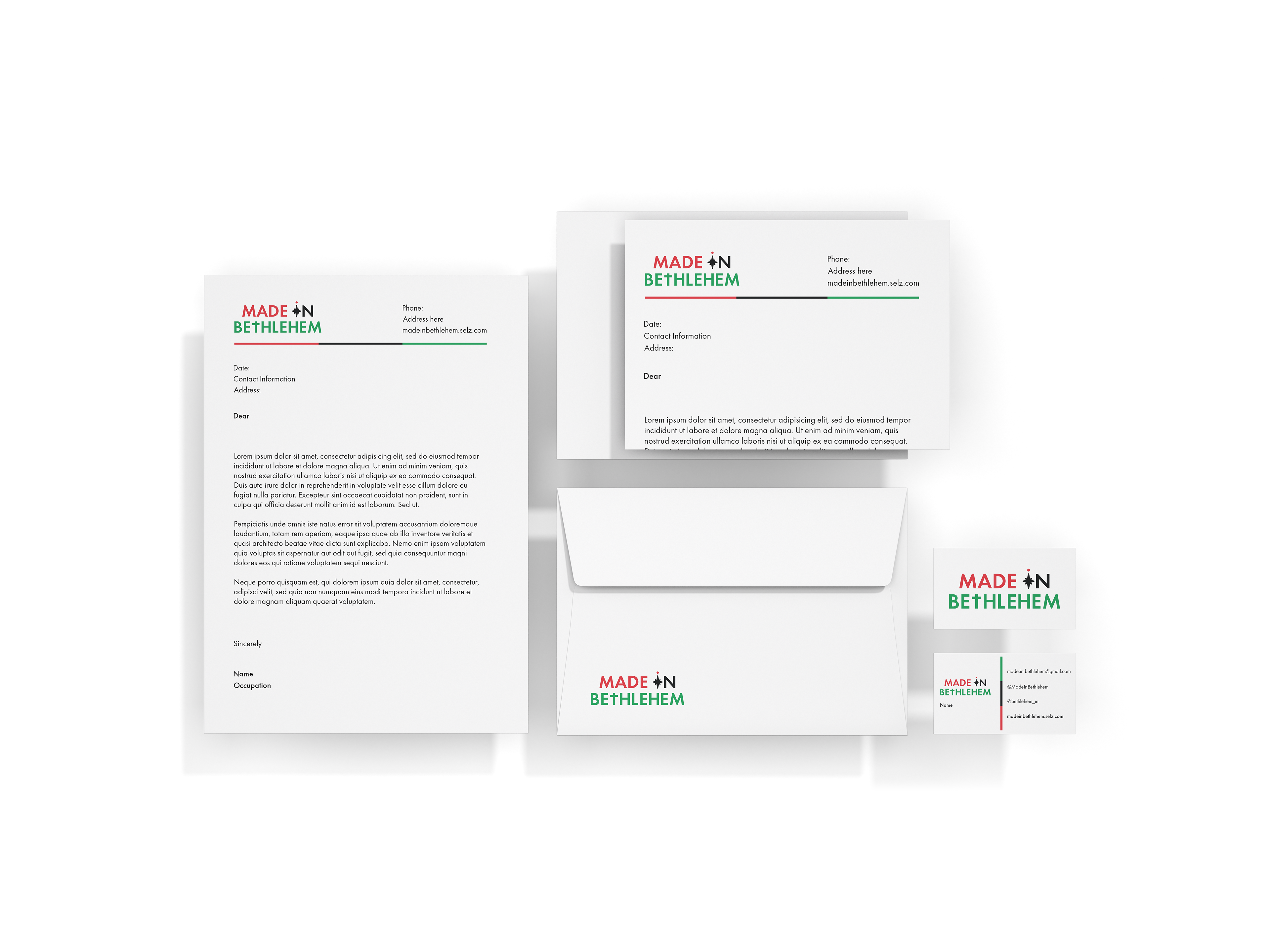
Here is the full brand guide I sent over to my client. I made sure the information was clear and easy to follow, making sure to include imagery along with the explanation to make it easier for him to understand how to apply the brand in the future.