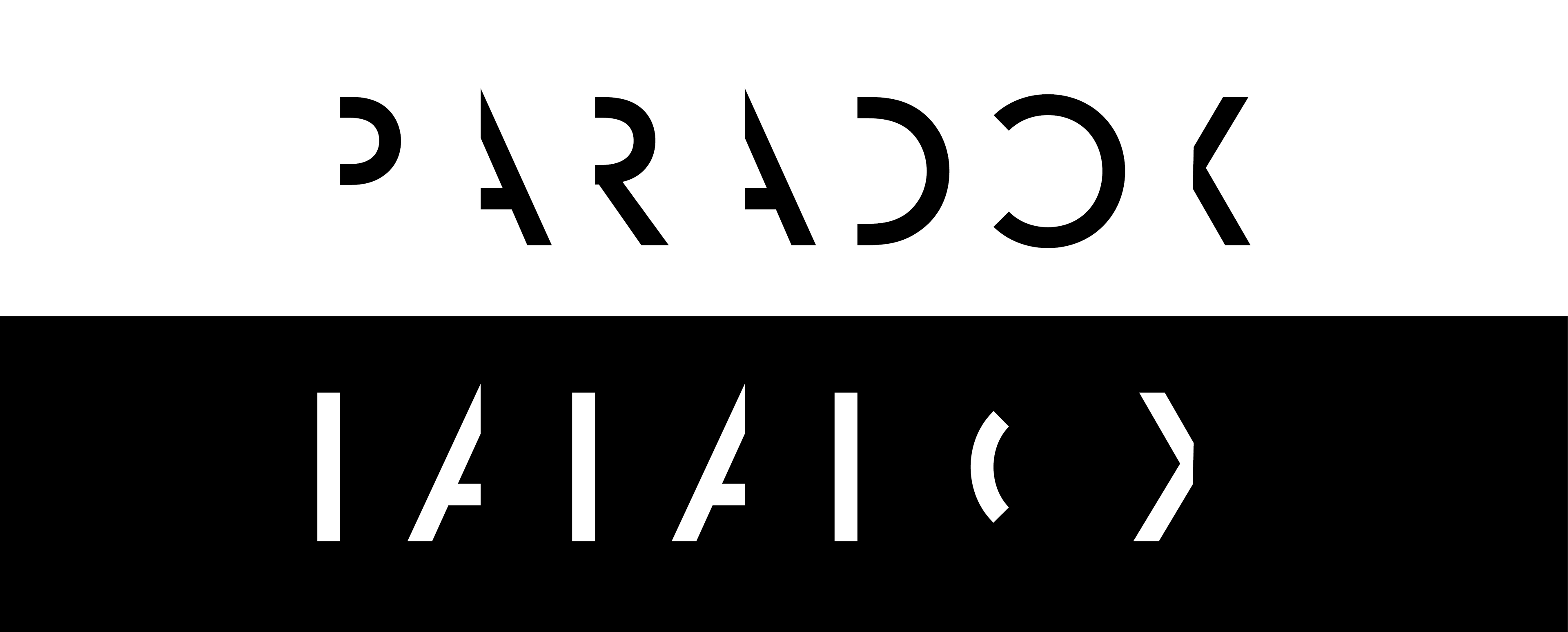
Logo designed by me
Fictional exhibition showcase:
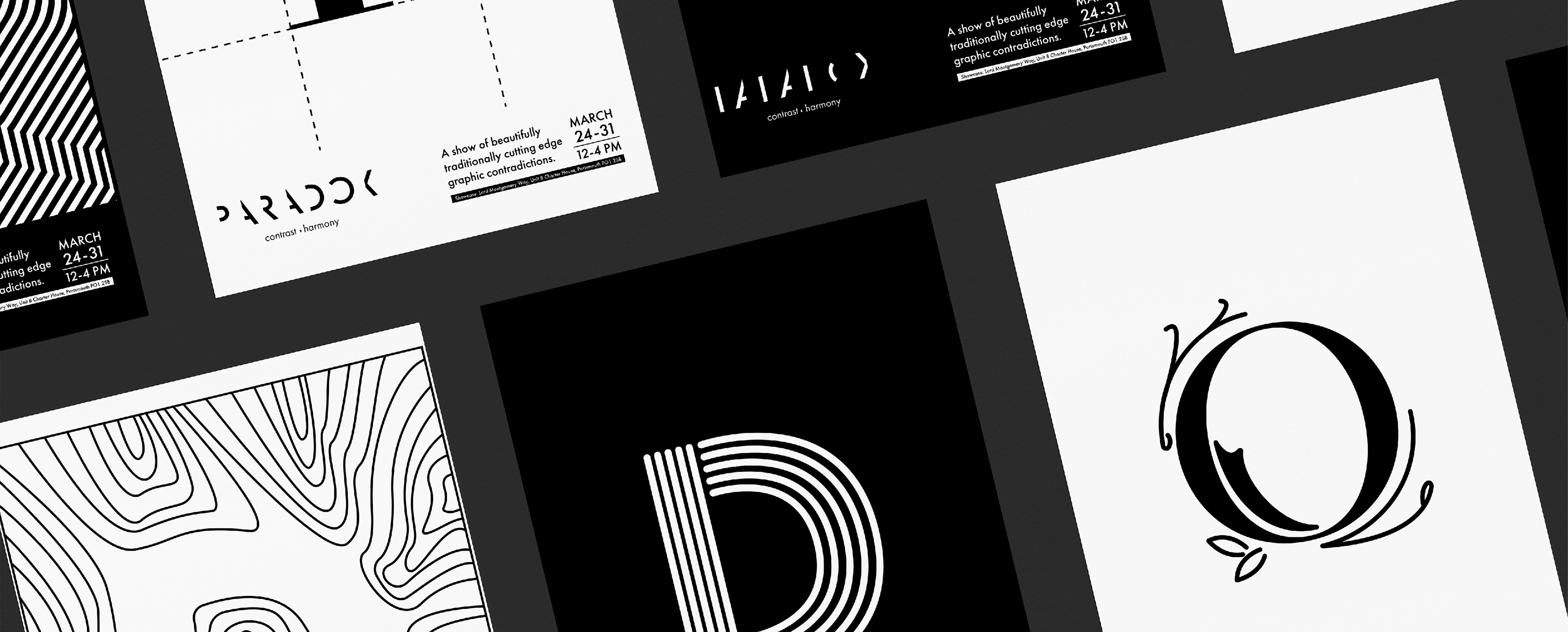
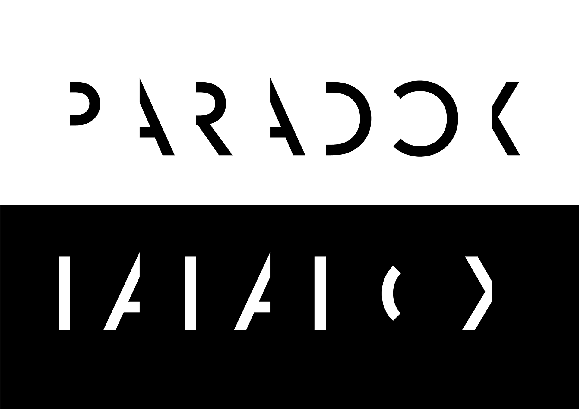
As part of a project for university me and 4 other designers were tasked to create an identity behind a fictional showcase that presented our work off as part of a collective. Since our group had many distinct styles that clashed with one another we decided to turn that disadvantage into our core concept of Paradox, with our branding being split into two which is represented by the two contrasting colours.
Designers that were part of this project are:
Animation designed by Christopher Steele
The animation designed by Christopher Steele would open up our showcase to audiences and set the tone for the event. This is to get audiences excited with the animation made to feel like you are being transported into another world.

We at Paradox want to be seen as a jack of all trades with many of us having many various skills that work in unison with one another to create new and interesting visuals. This is where our slogan of contrast and harmony originated was created.
We use a simple black and white colour scheme as we didn't want to distract from the designs we're presenting. With this in mind, we chose to keep our branding very minimal as this would suit the colour scheme.
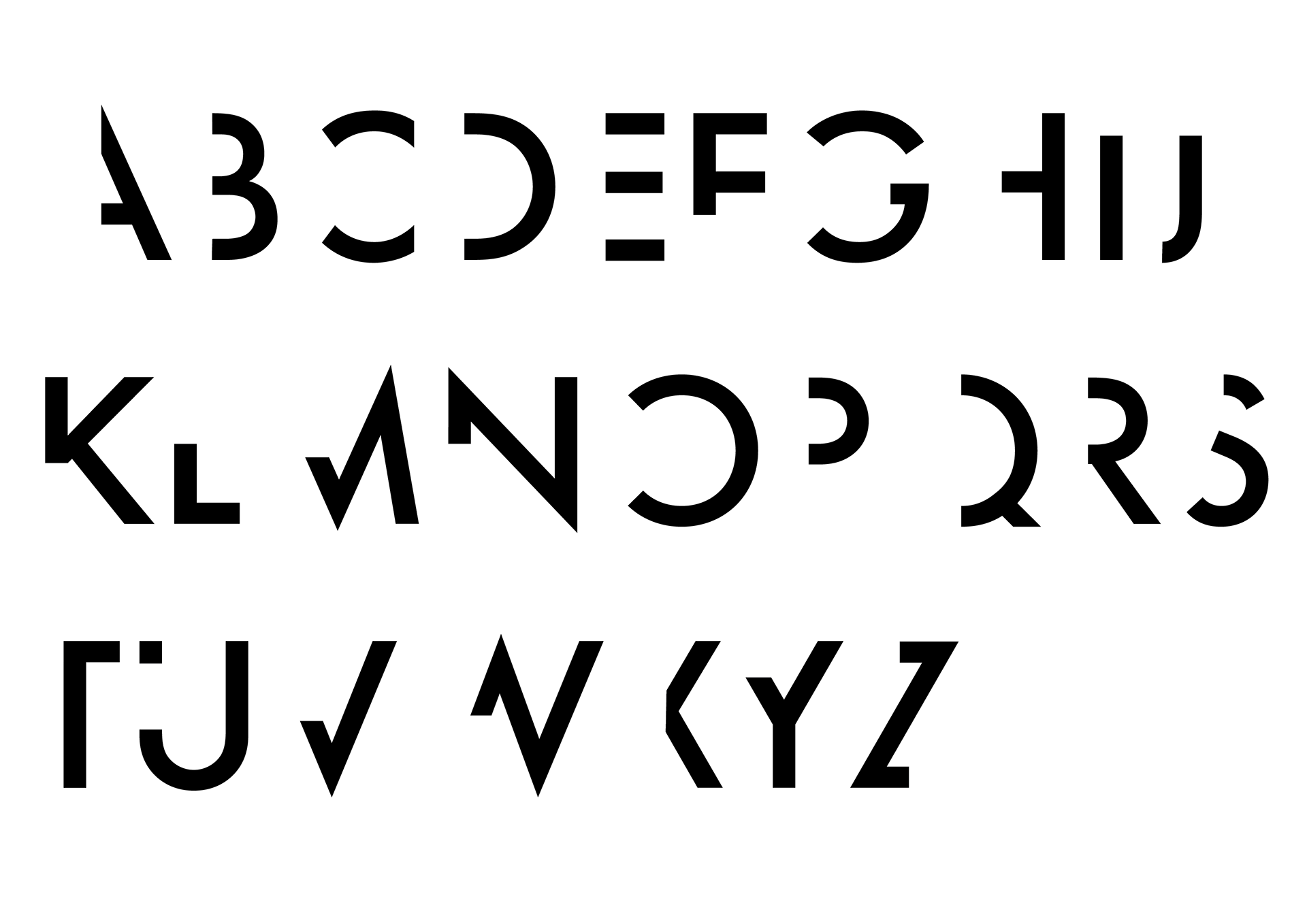
Black Typeface designed by me
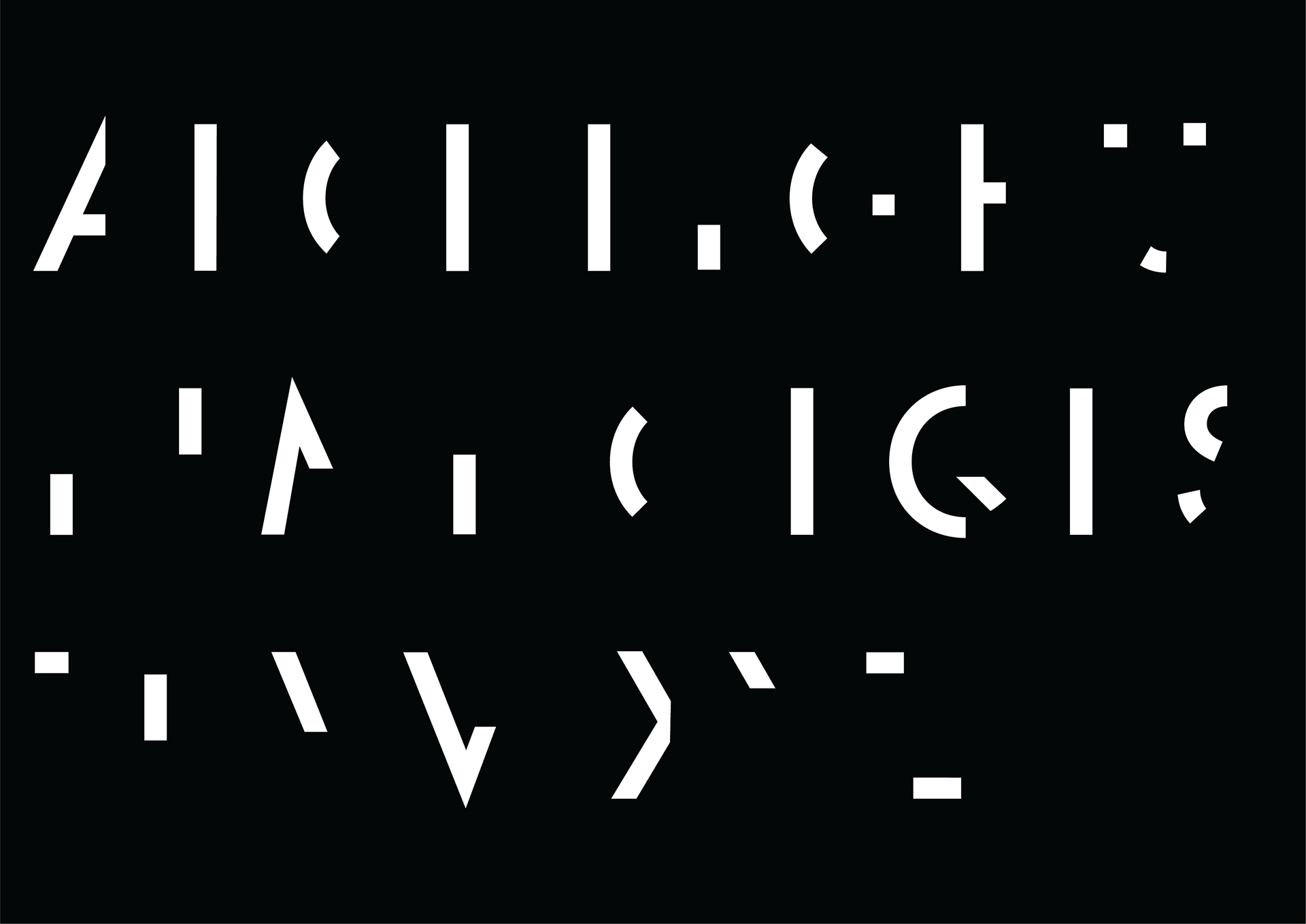
Reverse Typeface designed by me
Since the core concept of our branding is contrast and split I wanted this to be reflected in our typography. I designed this new display typeface based on Futura medium a modern typeface that reflects our minimal colour scheme and following the principles of gestalt theory.
As this is very detailed the purpose of the typeface is to be used for display and used sparingly, with the black typeface being the main one we use while the reverse used to accompany the black. For regular body copy using Futura was the best choice as it matched with the typeface I created.
Application:
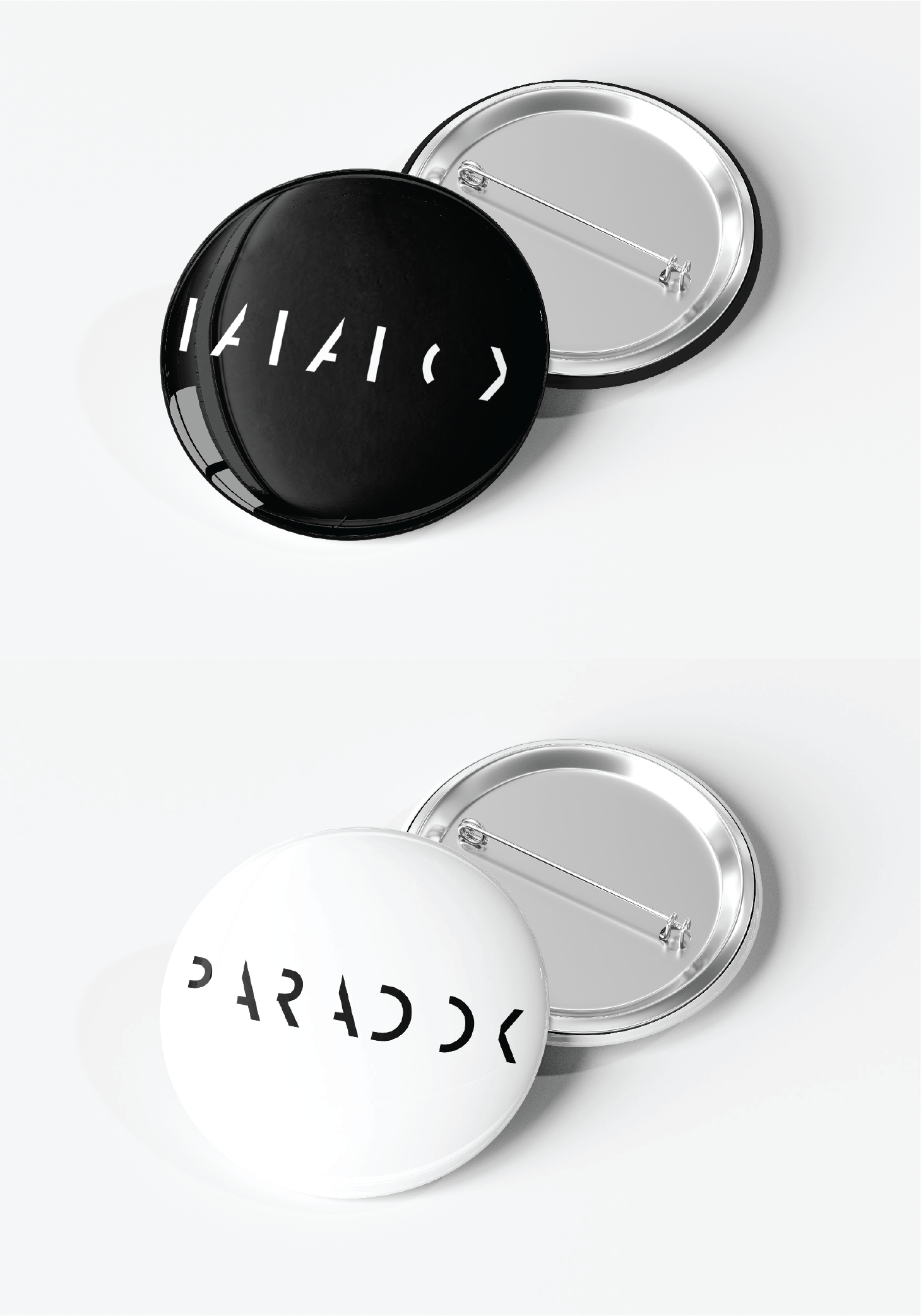
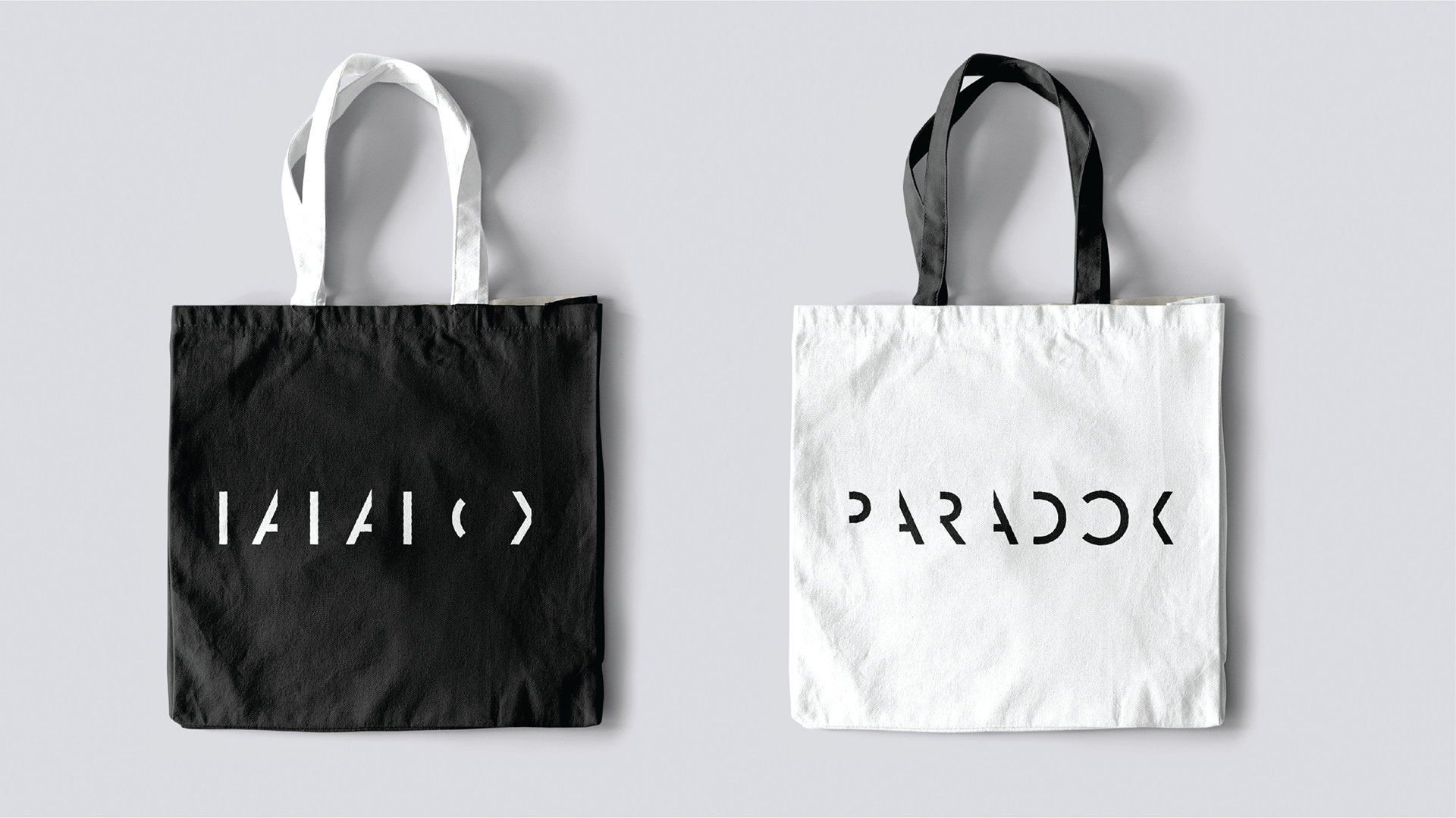
We created a range of assets from invites to send to design studios, websites for people to visit and badges. This was to get the word out about our showcase and get as many people as we can to come and see our work. We kept the designs consistent with our branding with the split being seen in every piece of design here.
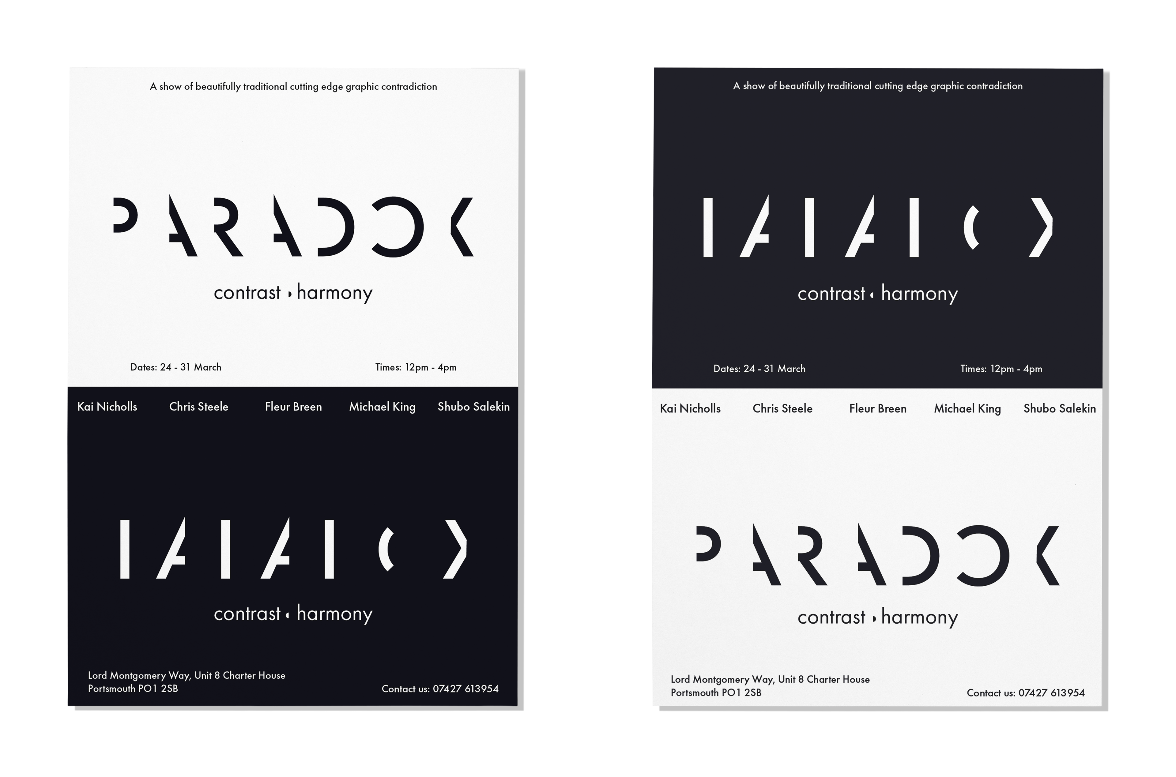
Invites designed and mocked up by me
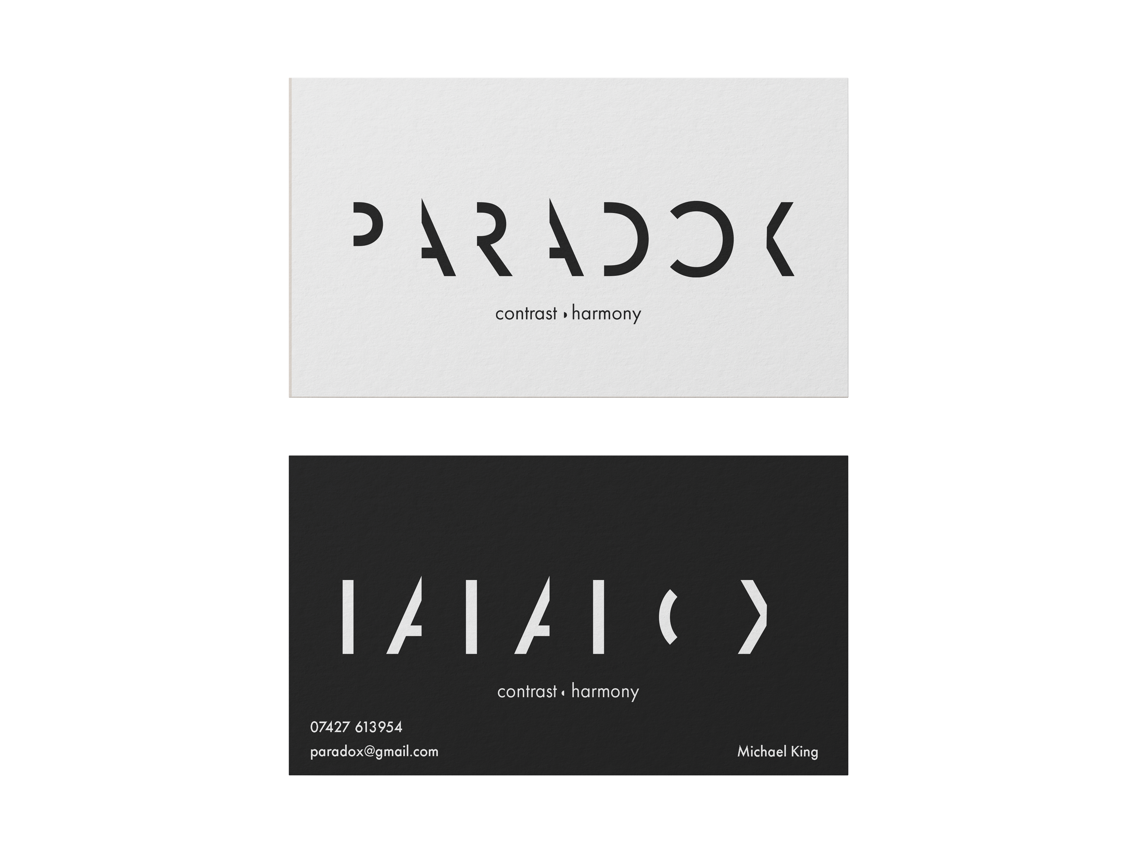
Business cards designed and mocked up by me
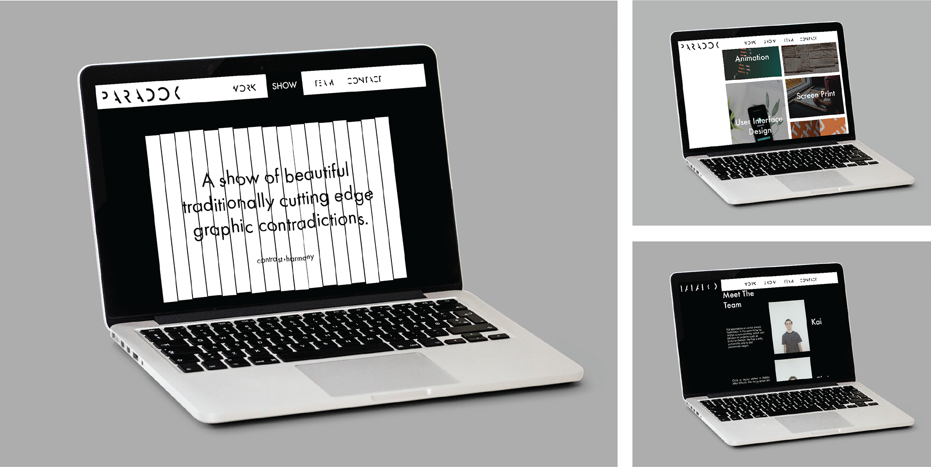
Website designed and mocked up by Fleur Breen
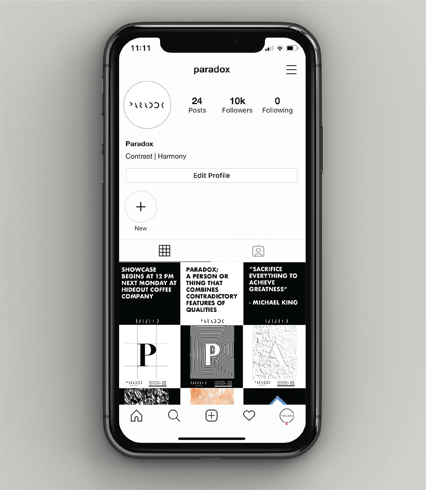
Social media designed and mocked up by Kai Nicholls
Designed and mocked up by Christopher Steele
Designed and mocked up by Christopher Steele
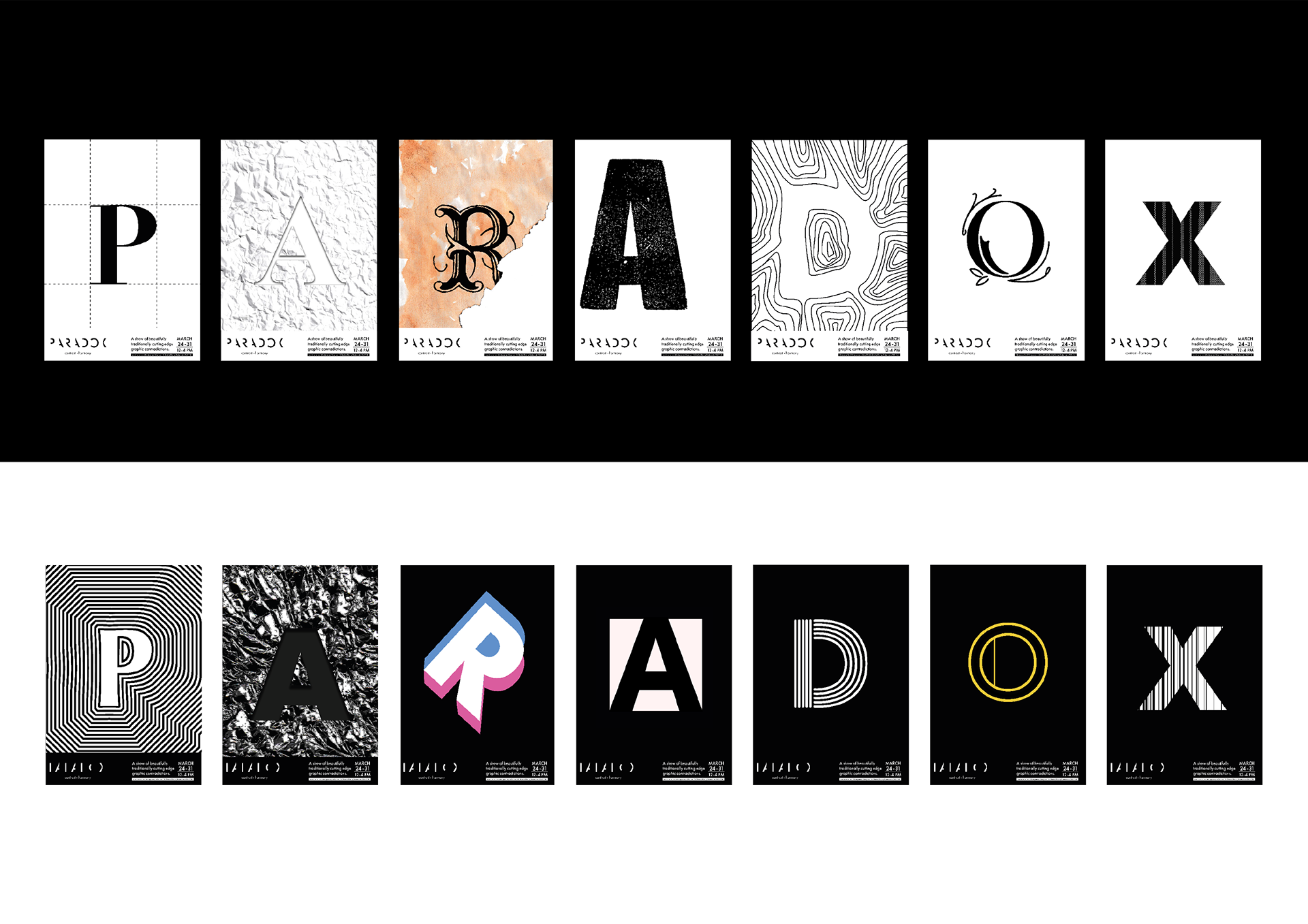
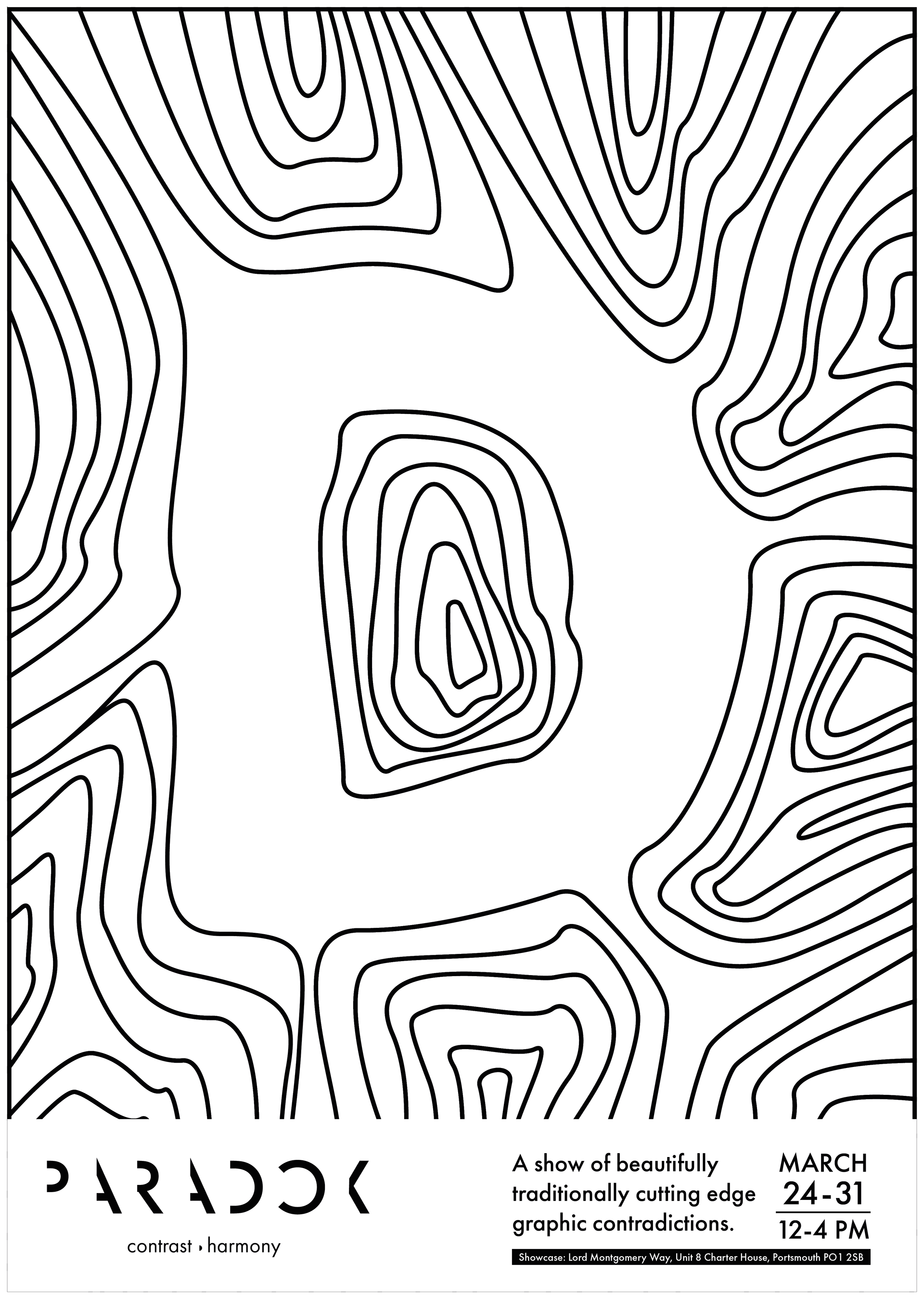
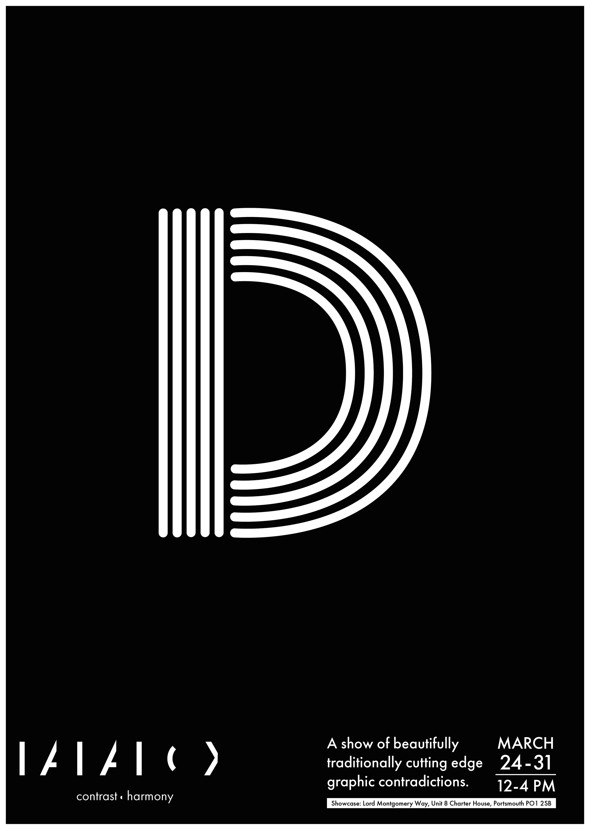
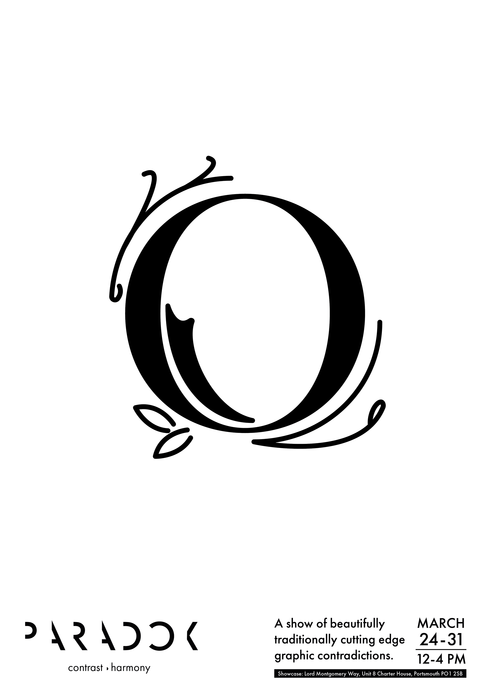
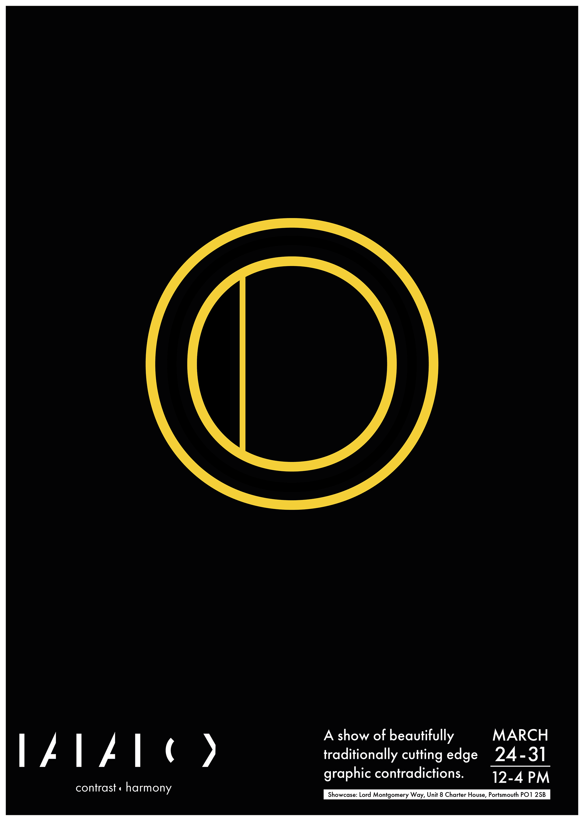
Posters:
A series of posters were designed by us as an additional method of spreading awareness about our showcase. We decided to do something different with our posters as we wanted to show off each of our styles since it matches with the work we are going to be showing. For this, we designed two sets of contrasting posters representing each of the letters of the showcase with mine shown underneath.
Collective Posters: